Topics
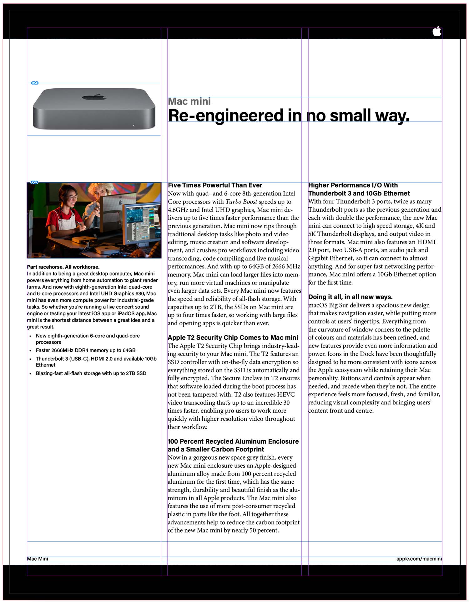
This is going to be our first foray into page layout in InDesign. We’ll build a single-page sell sheet for Apple’s Mac Mini. The goal here is to build it as a bit of template, so we can swap out the content for a different product in the future. All the tools below help us create this layout with that goal in mind.
Using Fonts
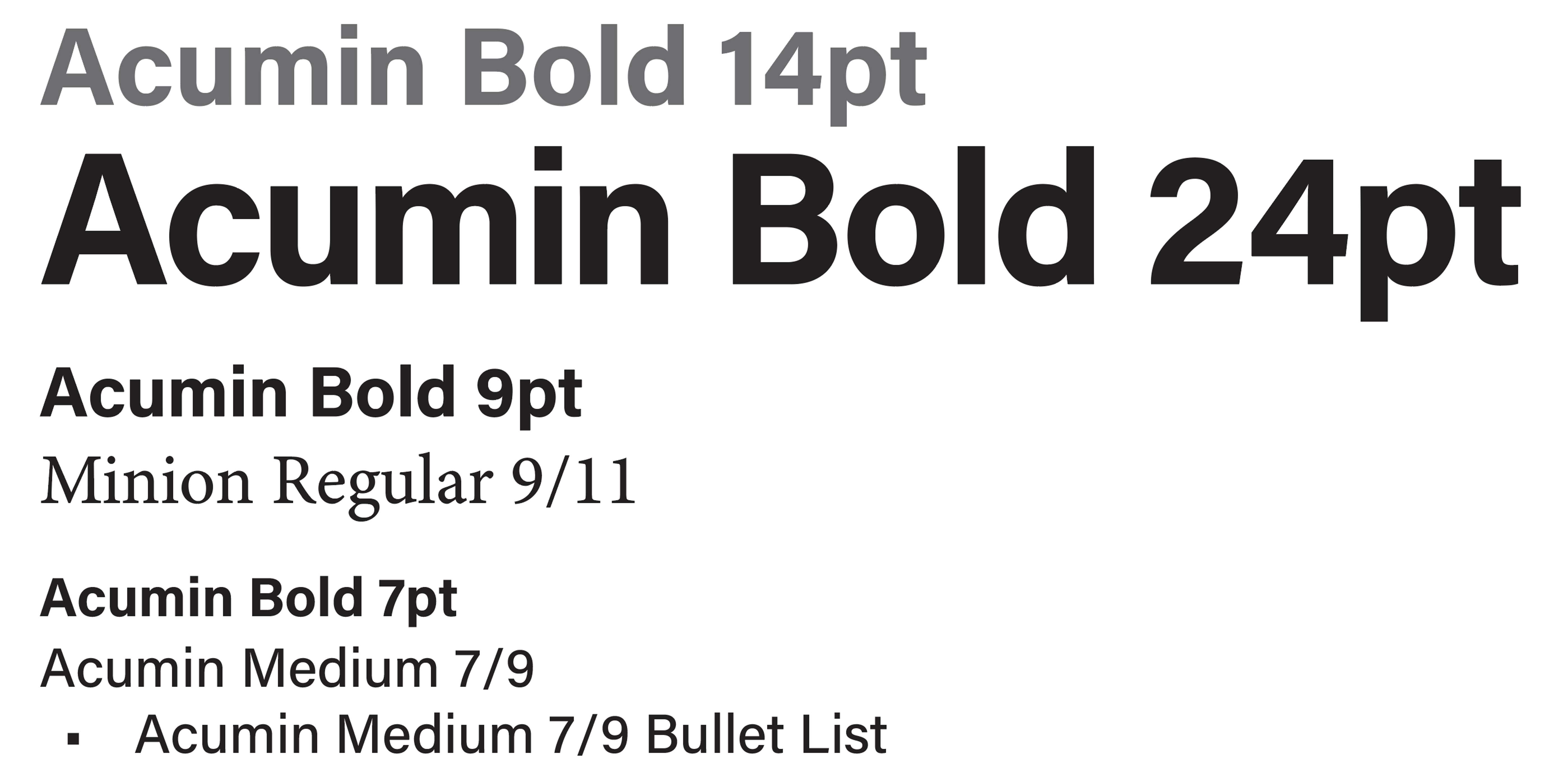
This document uses two typefaces: Acumin Variable Concept and Minion Variable Concept.

Acumin is a neo-grotesque sans-serif typeface. It’s best used for headlines. Minion is a serif typeface. It’s great for body copy. This is a good general rule: sans-serif fonts for titles and serif fonts for long lengths of text.
This is an explanation of point, picas and inches.

The What, Why & How of Style Sheets
Style sheets allow you to store the appearance settings of text in a central location called either a paragraph style or a character style.
The greatest benefit of style sheets is that you can change their settings, then all the text that has that style applied changes automatically. The beauty of this is the speed that changes can be made. Also, the lack of manual, one-off edits makes for fewer user errors and omissions.
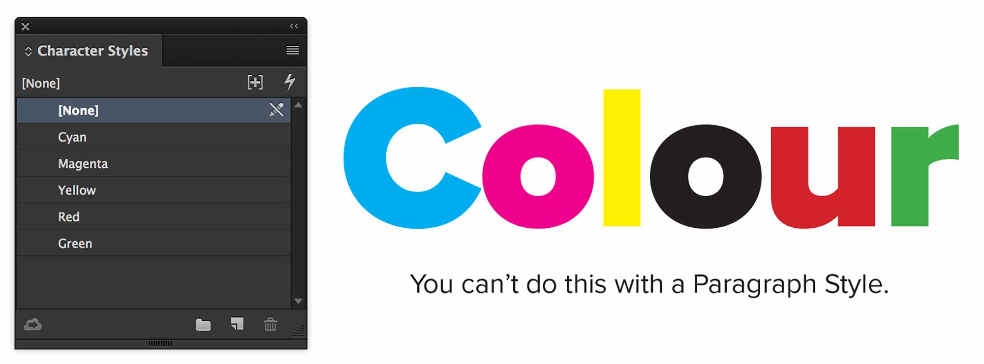
Paragraph Vs. Character Styles
Paragraph Styles are so-called because they only apply to whole paragraphs of text. You cannot make one word italic with a Paragraph Style. That’s what Character Styles are for.
The rule for deciding which to use is to default to Paragraph Styles until they can’t do what you want them to. Never use Character Styles unless you’re styling letters within a paragraph. Otherwise, forget they exist.
Character Styles are only used to style elements within a block, not the whole block itself.
Character styles are most often used from within paragraph styles. These are called nested styles. Character styles may be nested in different ways. There are InDesign’s actual Nested Styles, there are Grep Styles and others. We use these because applying Character Styles manually is very tedious.
Paragraph Styles
What is a Paragraph?
Most of the work we need to do to create this layout is simply creating paragraph styles, then applying them to the text.
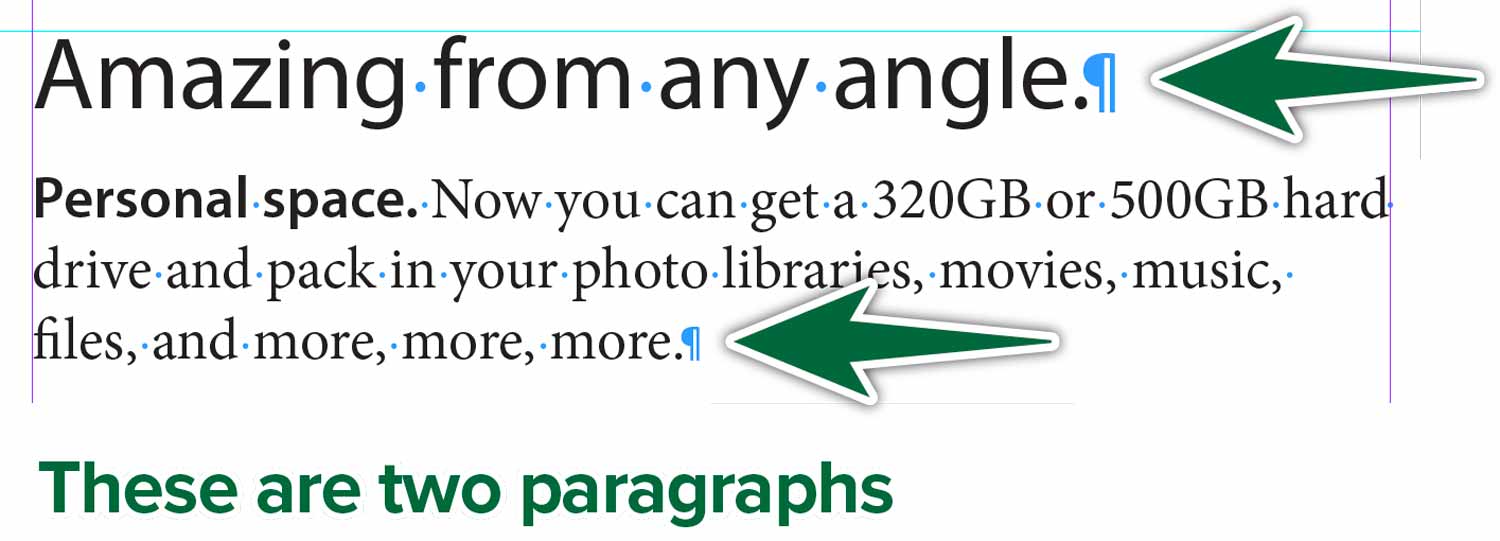
Paragraph styles can only style whatever is between to Pilcrow ¶ characters.
To InDesign, what follows is a paragraph.
Z
The letter Z above is a paragraph, according to InDesign, because there’s a Pilcrow before and after it.
Setting Base Styles
Formatting text in InDesign can either be a headache or a pleasure. We’ll give you the tools you need to make styling text quick and error-free.
Before we can start formatting the document text, we need to create a few base paragraph styles.
Edit Basic Paragraph
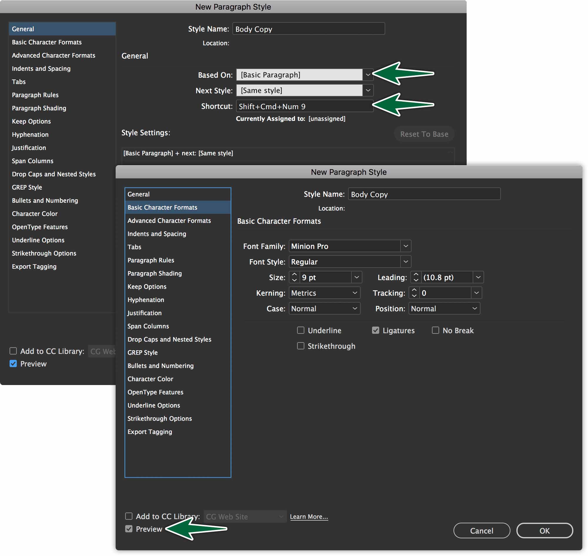
In all InDesign documents, there’s a Basic Paragraph Style. It’s the default stylesheet that applies to all text as it’s brought into InDesign. It’s a good idea to change its font and size to the size of your planned Body Copy style.
Paragraph Styles inherit properties from parent paragraph styles. We’re going to create underlying serif and sans-serif styles. Each will have only minimal styling, including the font selection and not much else. The base serif style is the Basic Paragraph Style. We’ll create a new stylesheet for the Base Sans.
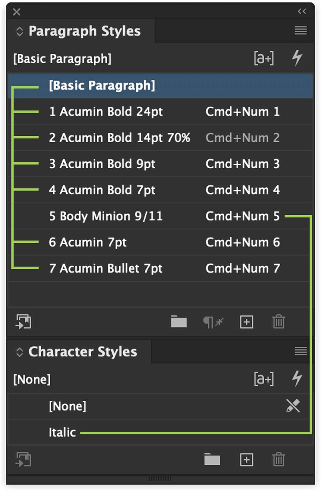
This makes it that you can change a font across a whole document by changing only this one stylesheet. As an example. If all of your titles are styled in Acumin.
You’ll base all of your sans-serif styles on your Base Sans. If your client (or your teacher) then asks you to change all titles to a different font, you only need to change the Base Sans. Because all others have it as a parent, they’ll all change.
Make the most of this inheritance property for style sheets.
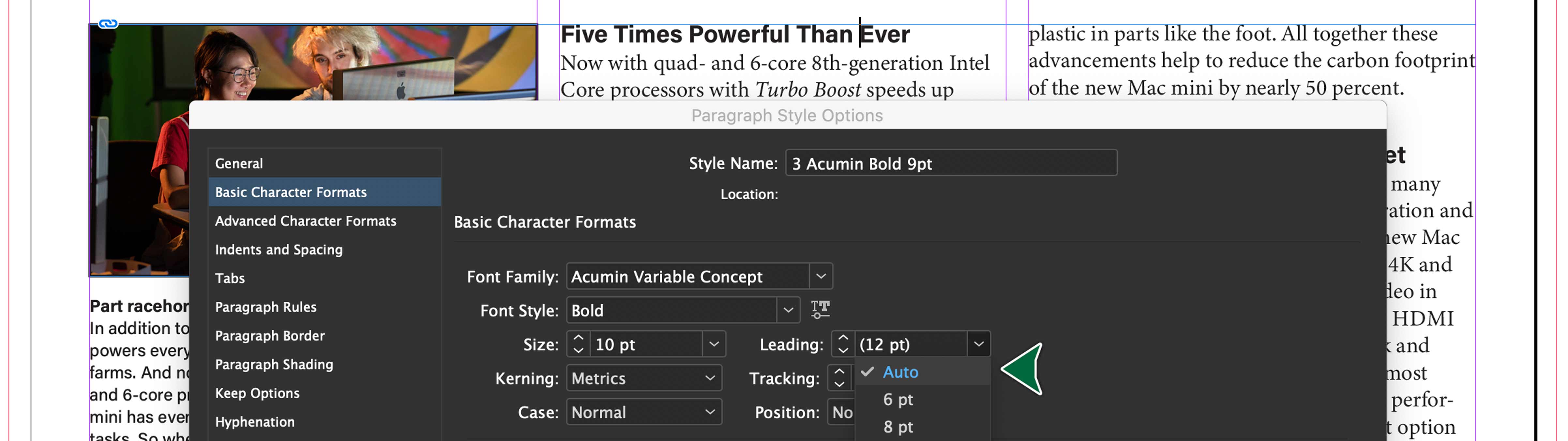
Size and Leading
In your Paragraph Styles, you can define the size of the text and its leading. These settings are found in Basic Character Formats in your stylesheet’s settings. If you’re just starting out, it’s a good idea to leave the leading to Auto. This establishes a 120% value. So 10 point type will have a 12 point leading.
Paragraph Spacing
When reading text, it’s ideal to have a visual indication of the end of a paragraph and the start of the next. This is either achieved with a first line indent or a space after the paragraph — never both.
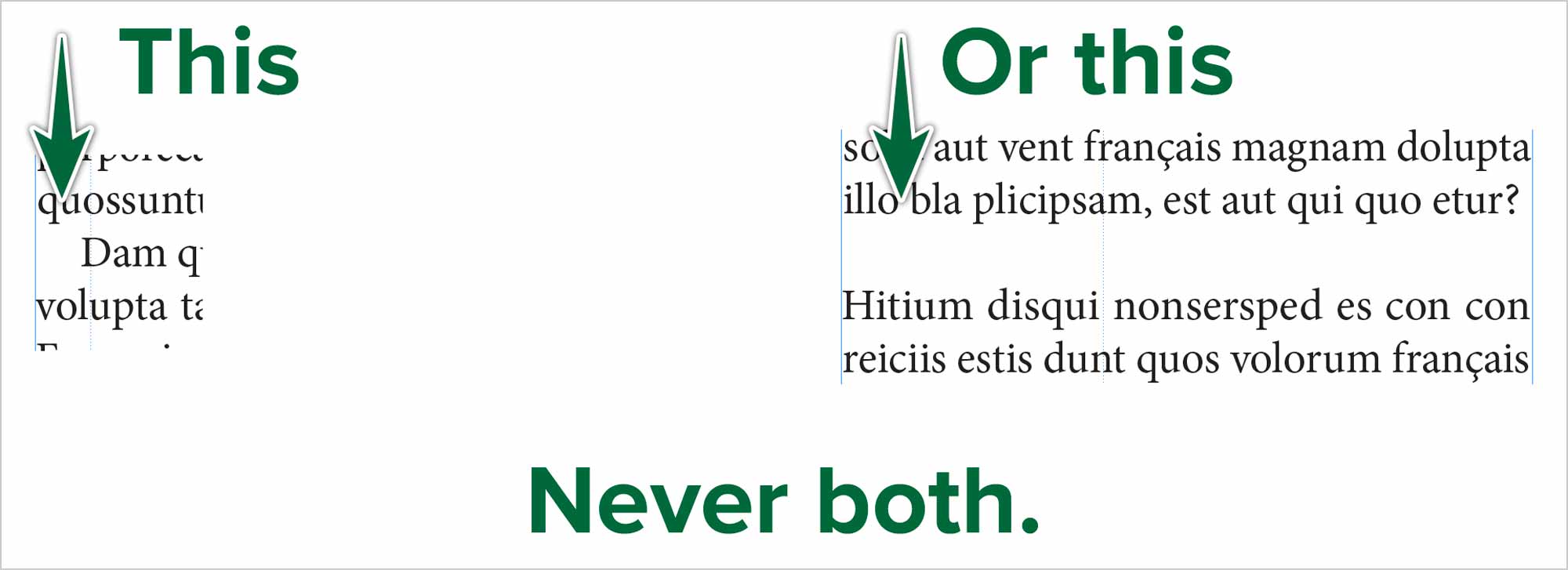
You can see an example of a first line indent on the left of the above image. On the right, there’s a space after the paragraph. Choose one of the two treatments, not both. In this specific case, we’ll create space after paragraphs in our style sheet.
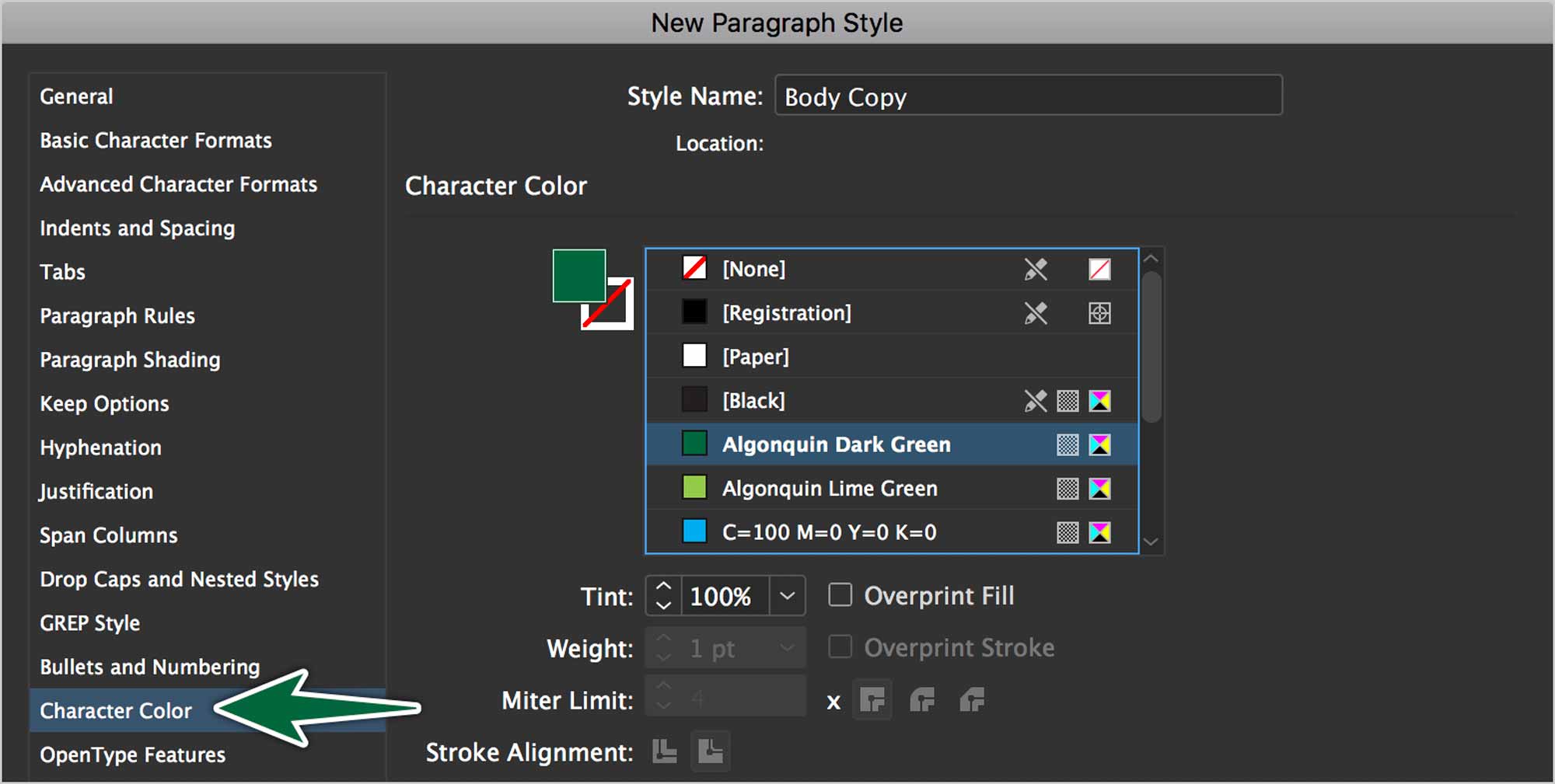
Text Colour
In some instances, you want to change the colour of your text. You can do this in a stylesheet, along with all the other properties. It’s found under the Character Colour pane in your stylesheets settings.
There are many, many more properties in the Paragraph Styles Options dialogue. We’ll explore most of them over time.
Columns of Text
When creating columns of text, always create multi-column text frames. Never create multiple separate text frames side-by-side. The main text of our whole layout is in one three-column text frame.
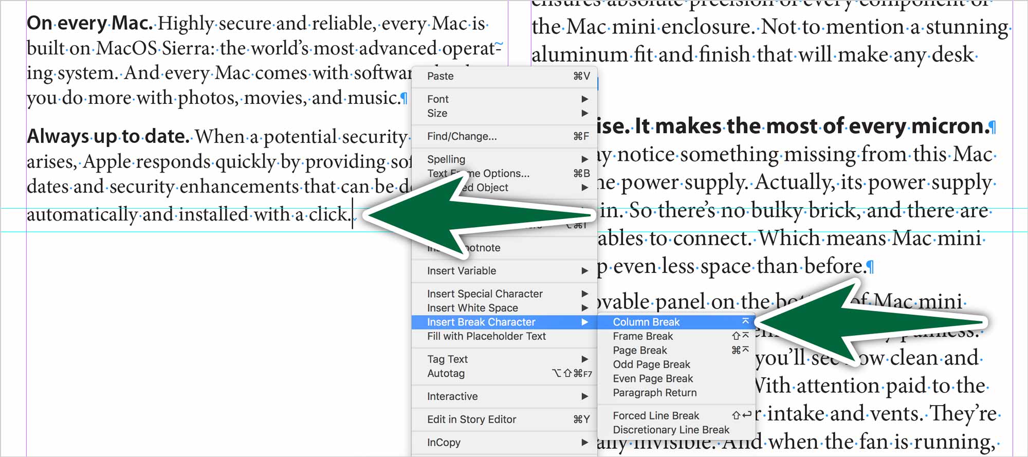
The proper method to get text to jump to the next column is to insert a column break. You can do this with a right-click or by typing Enter, not Return.
Make sure you delete every last character at the end of the paragraph the ∨ glyph needs to be the last glyph in the column, right after the period glyph.
Parent Pages
In publications, some elements repeat themselves on multiple pages. Rather than manually placing items on each page of your document, we place them on parent pages.
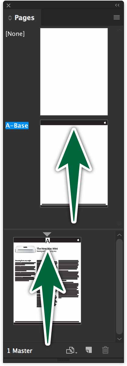
You can see, in the image above, that the black bar with the logo is on the Parent Page. You can also see the letter A at the top of the document page. That means A-Parent is applied to the document page. Anything on A-Parent will appear on page one.
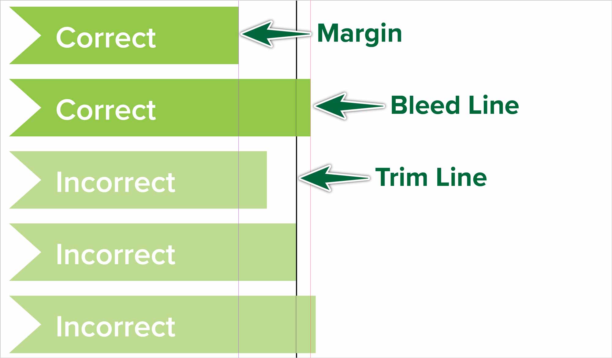
Bleeds
The bleed area is the narrow space all around the exterior of the pages ending at the red line. It’s extra space to prevent unsightly white area in case of inaccurate cutting by the printer. It’s generally one eighth of an inch. That’s 0.125” or 9 points.
Placing Images
In Adobe-speak, importing an image is called placing. We’ll place the image of the Mac Mini on the page. When you place an image, it’s always inside a frame.
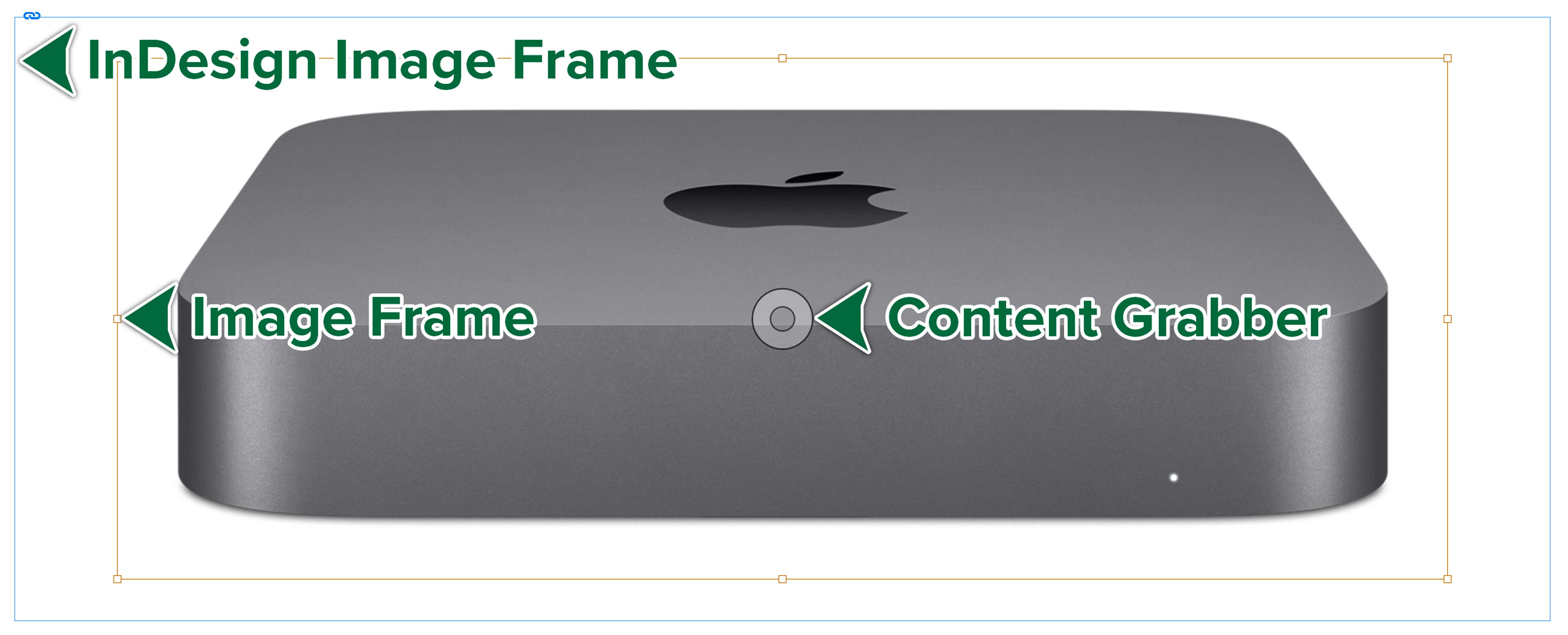
In the image above, the photo has a brown frame around it. That’s our Photoshop file. The blue box is the InDesign frame. See more about placing images here.
Preflight & Package
The nature of an InDesign document is that it depends on certain files being present on your computer or online. These inlclude photos, graphics and fonts. If these aren’t present, the document won’t display properly. An image may not appear at all. A font may be substituted for another, changing the look of your design.
Font Usage
Once you’re done your layout, you want to double-check that your font and image usage is correct. Let’s check fonts first. Go Type > Find Font…. A dialogue opens which shows you which fonts have been used in your document.
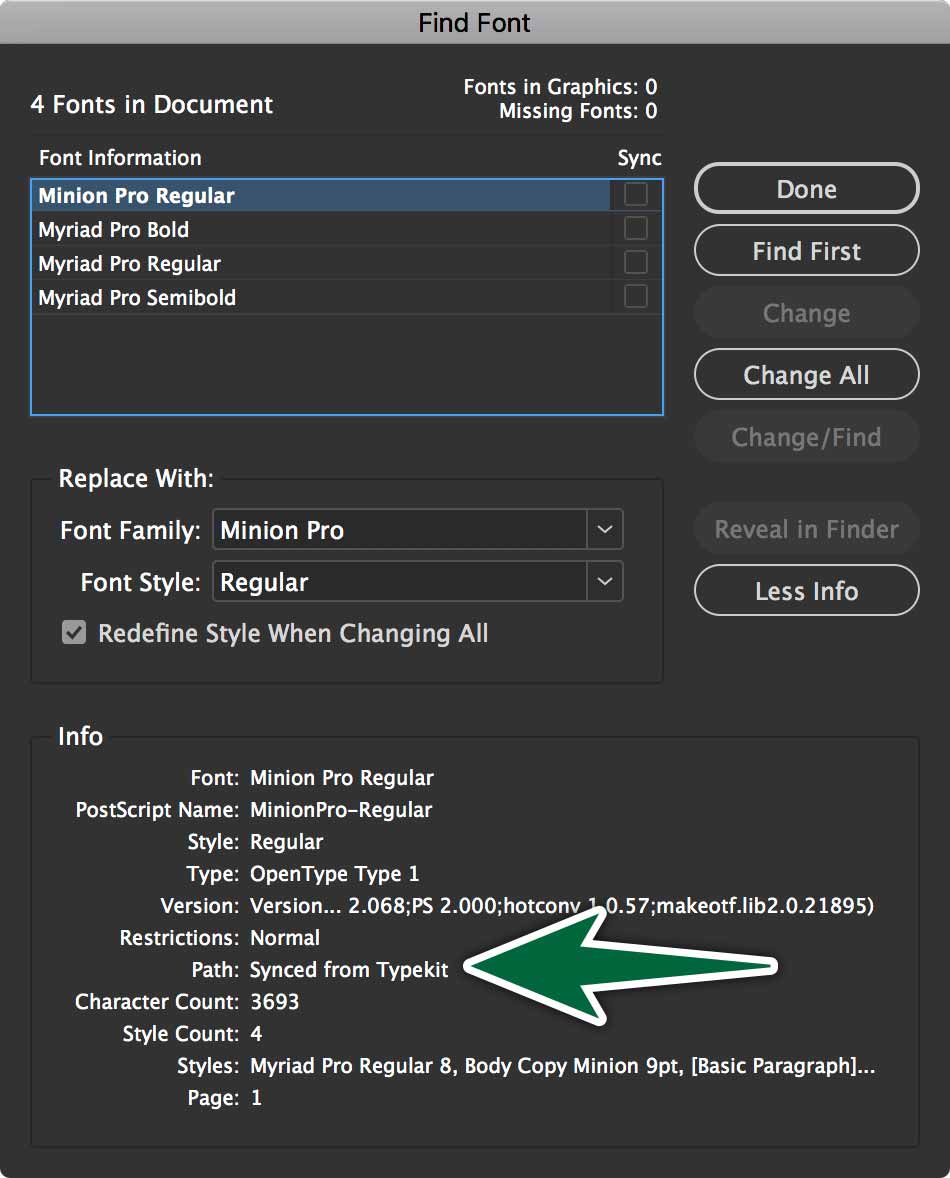
You can see in the Find Font dialogue that we only have the fonts we’ve actually used in our document.
Image Usage
We need to ensure that the images we’ve place in our document are properly linked to our file. To do so, we can check our Links panel. Go Window > Links. This panel has a list of each object we’ve placed on our pages. It also displays the properties of those images and graphics.
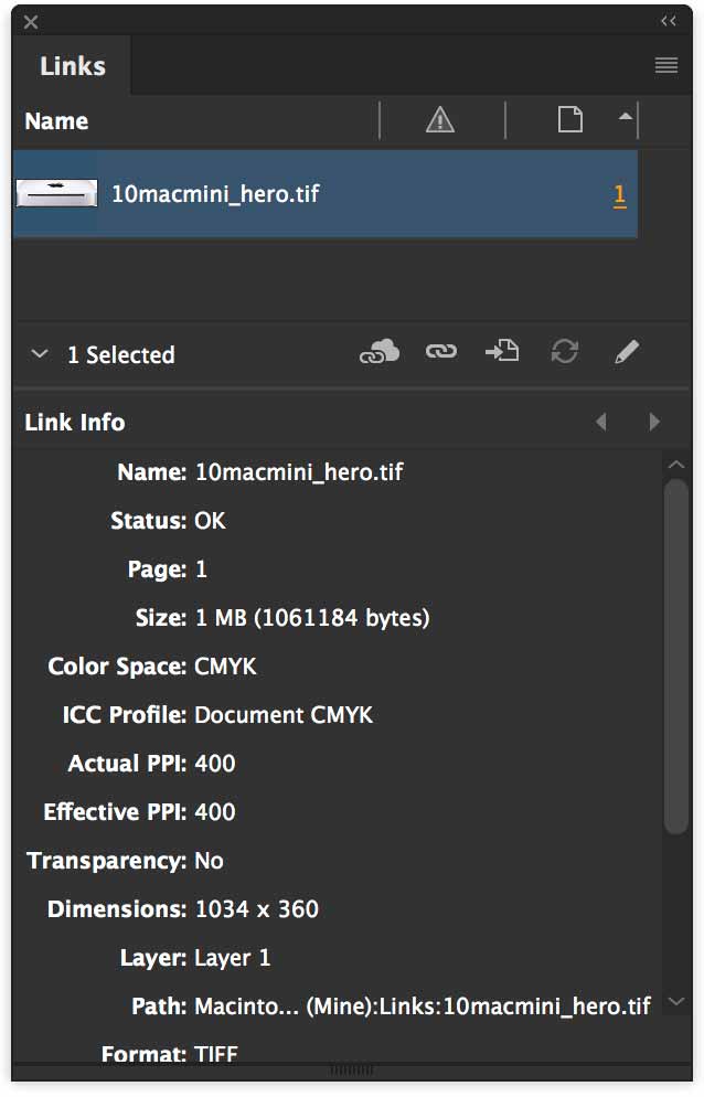
If there’s a problem with an image, there will either be a question mark or an exclamation mark next to it in the Links Panel. A qestion mark means that the image has been edited since you placed it in InDesign. An exclamation mark means InDesign doesn’t know where the image is on our computer.
Packaging
The Package command is under File > Package…. The packaging process gathers all files related to an InDesign document, then copies them into a new folder. This folder has your self-contained project in it, which you an hand off to a printer for production.
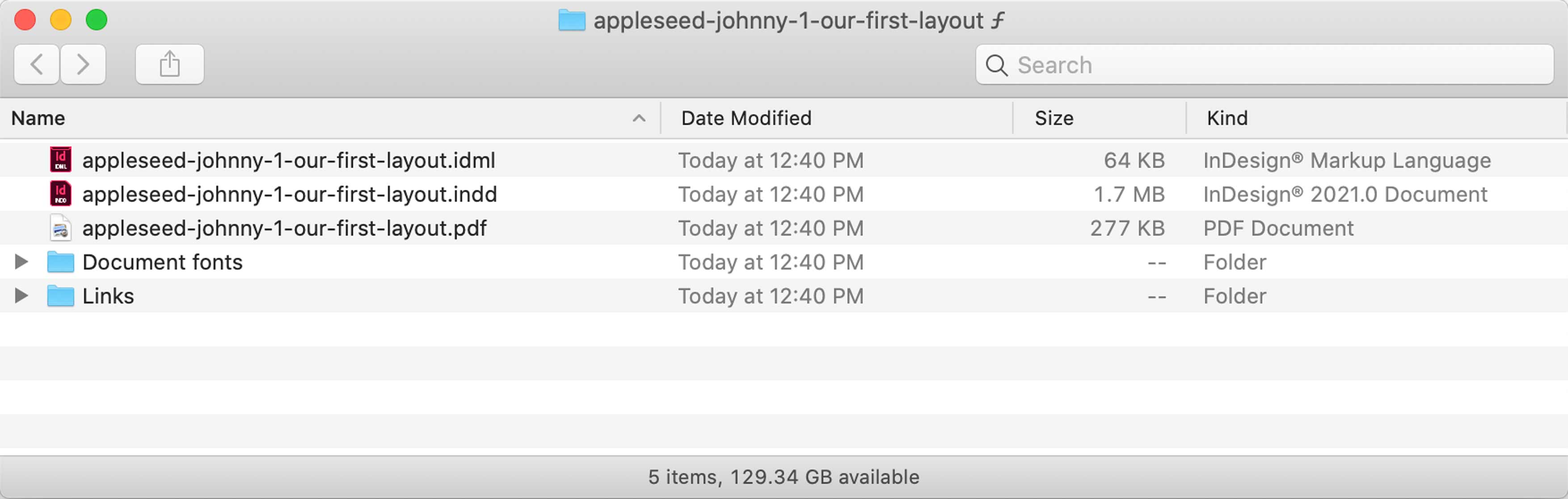
The package folder includes your InDesign document with all its support files — images and fonts. It can include a PDF of layout. You can also produce an IDML file which is your layout file, openable in older versions of InDesign.
The package folder automatically gets named with the document name. The whole folder is what you need to zip-compress to submit.
To compress the folder, right-click on it, then choose Compress… Submit that zip file.
Formative Activity
This is what our final layout is going to look like. Note how everything in the layout lines up with grid we’ve established in the document setup.
Go File > New in InDesign. We’ll create a single-page document with:
- No facing pages
- 3 columns
- 0p9 point gutters
- 2p0 point margins
- 0p9 point bleeds
Type Specimen
We’ll be using Acumin Variable Concept and Minion Pro Variable Concept in this layout.
Save the File
Let’s save our InDesign document as:
into the folder you downloaded.
