Topics
New Document Colour Options
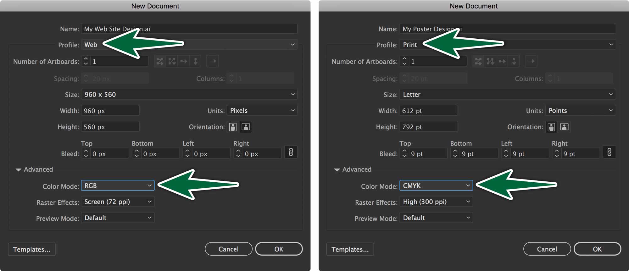
You need to make decisions about colour when you first create your Illustrator documents. For example, you can see that when you choose Web from the Profile drop-down menu, you automatically get a document in RGB mode. You would use only RGB colours in this document. If you were to choose RGB colours with the CMYK sliders, you risk that they’ll be outside of gammut. That means that they won’t display accurately.

The same goes for design for print. You need to build all your colours with the CMYK colour space for four colour process output.
Types of Swatches
Illustrator has a number of different types of swatches. We’ll create some of each of the solid colour swatches and apply them to the provided logo artwork. This is important to us because of how offset printing (or lithography) works.
Regular Swatches
A regular swatch has a plain icon in the panel. It can be in RGB or in CMYK. These are meant for use in four colour process printing (CMYK) or design for the screen (RGB).
Greyscale swatches print only on the black plate on a printing press. CMYK swatches are produced across all cyan, magenta, yellow and black plates in four colour process offset printing. RGB swatches are used for design for the screen. If you apply a regular swatch’s colour to some artwork, then change the swatch colour, the artwork isn’t affected.
Global Swatches
The real magic happens when you create Global Swatches. Global swatches can be in CMYK or RGB.
They are particularly useful when doing work which will undergo many revisions. When Global swatch colours change, the artwork with those colours change too. Notice that spot colour swatches are also global swatches. All swatches that have a triangular corner on them are global.
Illustrator creates Global Swatches by default. Apply the colours to your art. If you need to change colours, you can double-click on the corresponding swatch to edit it. Once you accept the change, all artwork with that swatch gets the new colour. Like I said, magic.
Spot Colour Swatches
Spot colour swatches are based on colours from Pantone colour books. Each colour is meant to print on one colour plate on an offset press.
We will start by finding spot colours from a Pantone library. We’ll add them to our document’s Swatches panel, then apply them to our logo art.
Useful Panels
Before we get to work, let’s hide all of our panels with Shift-Tab, then open only three of them:

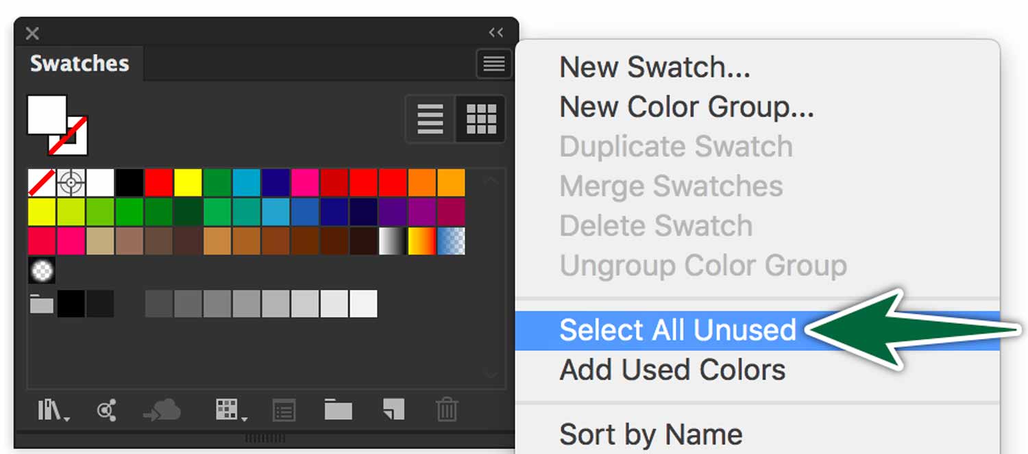
We can also delete all the swatches we don’t need from the swatches panel from the panel’s menu.

Colour Spaces
- Greyscale
- The first logo would appear on a single colour plate if printed to press.
- Spot Colours
- This logo would separate onto two spot colour plates for two-colour printing.
- CMYK Colours
- Process colours are cyan, magenta, yellow and black. These colours combine on press to produce all printable colours.
- RGB Colours
- RGB colours are used for displaying on-screen. Any screen. In fact, any colour that’s produced with light.
There are more colours in the RGB colour space than in CMYK. Almost all CMYK colours convert precisely to RGB; not so the other way around. The fact that the CMYK space is so much smaller than the RGB space is the reason why colours change when you switch from RGB to CMYK.
Applying Swatches
Depending on the type of production you need, you’ll use different types of swatches.

Select elements of each logo to apply the proper colours. There’s a guide in the provided document.
When it comes to the RGB graphics, you need to create a new document that’s in RGB colour mode. Paste the graphic into this new document and save it as rgb.ai in our working folder.
Formative Activity
Apply colours to the logo as directed in the provided Illustrator document. Make sure you check your work with the Separations Preview panel.

Remember to create a new Illustrator document in RGB mode to paste the graphic into. Save it into the exercise folder. Save it as rgb.ai.


