Topics
The Context
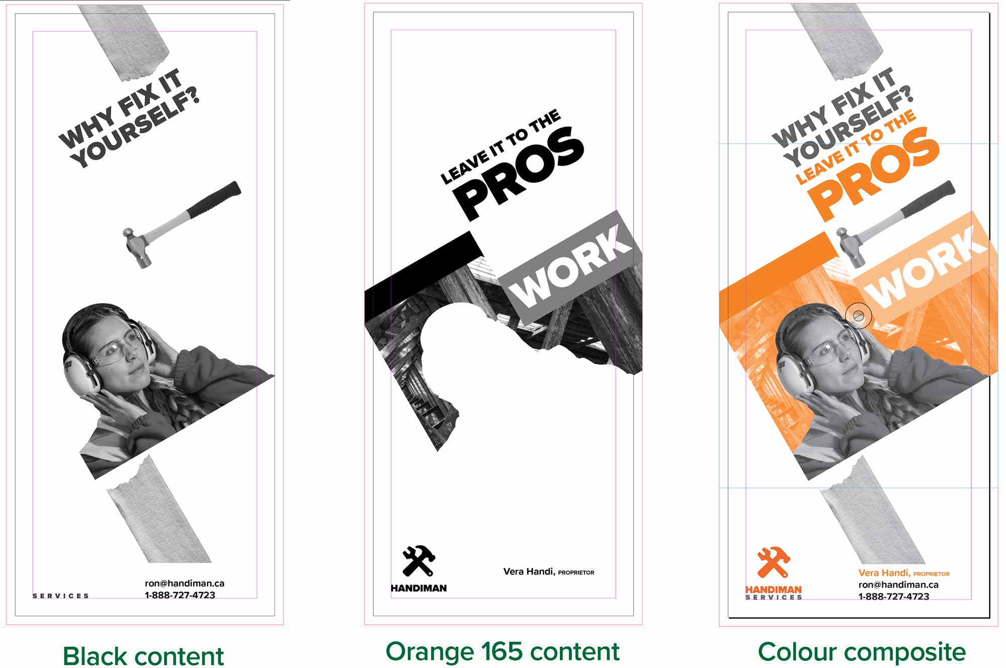
This is an ad for a home renovation company, using our two spot colours. Every element in this ad is either black or in Pantone 165. The first frame shows the black content of the ad in InDesign. The second is all the orange 165 content. The third plate shows the colour composite.
The ad is an InDesign document, but it contains graphics from Illustrator (the logo) and Photoshop (the photo). No matter which application produced the artwork, it needs to be either in black or in our spot colour.
The difference with this print job and a four colour process job is that only two printing plates are produced rather than four. Less ink is used. It’s run on a smaller, two-colour press. A job like this could be given to a small printer who possibly charges less than a large operation.
To apply our spot colour to the artwork, we need to first add the swatches in the Swatches panel in both InDesign and in Illustrator. The process is different in Photoshop. In the InDesign document, go to your Swatches panel menu. Choose New Swatch….
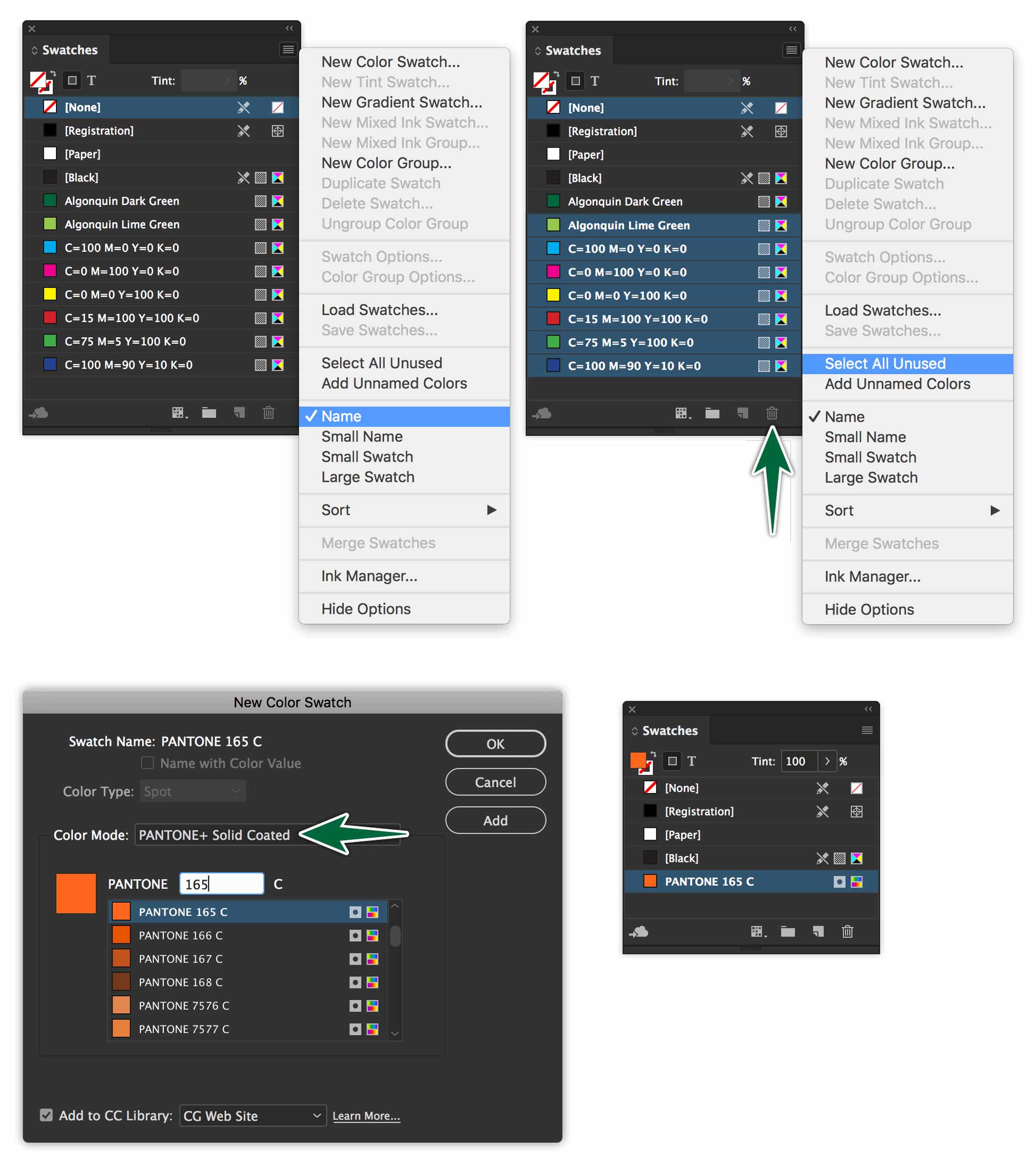
Do the same thing in Illustrator.
Select each piece of artwork in the InDesign document and in the Illustrator document. Apply the approriate spot colour to each. What’s orange needs to be in Pantone 165 C. What’s black needs to be in the regular black swatch you have in your Swatches panel.
While you’re at it, delete all the other swatches in the panel.
Spots in Photoshop
Every Photoshop image has one or more channels, each storing information about colour elements in the image. The number of default colour channels in an image depends on its colour mode. For example, a CMYK image has four channels, one each for cyan, magenta, yellow, and black information. Think of a channel as analogous to a plate in the printing process, with a separate plate applying each layer of colour. Spot colour channels are used to add spot colour plates for printing.
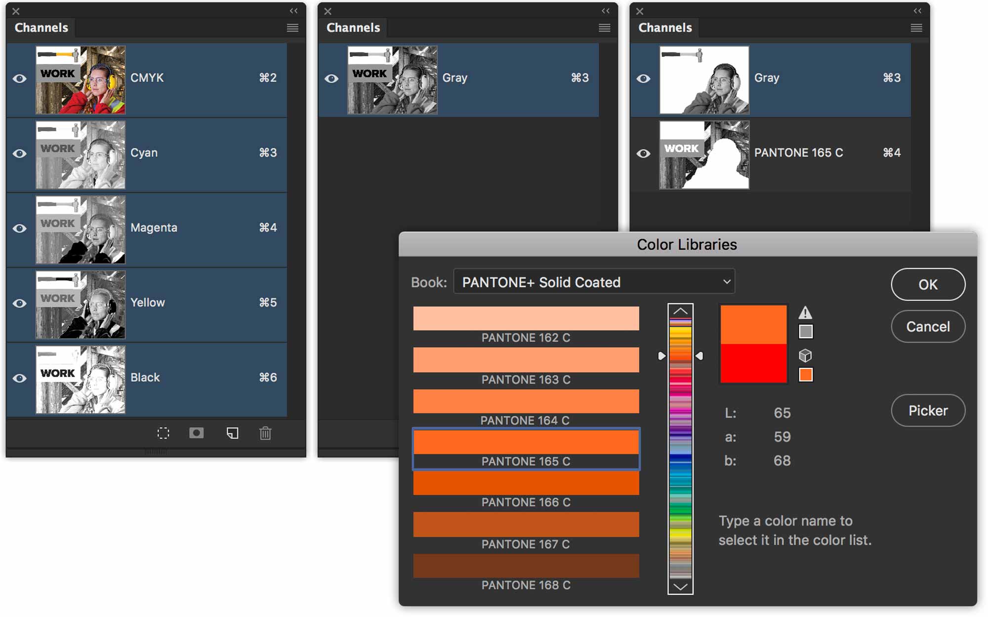
Convert the provided image to greyscale without merging layers. Now you can add a new spot colour channel with Pantone 165 C.
Use Cut and Paste to transfer pixels from the greyscale channel to the orange channel. Turn off all but the background layer’s visibility. Hit the D key to set your swatches to the default black and white. Select, then cut and paste it onto our new orange channel.
Punching a Hole in Spot Colours
Spot colour channels are usually displayed in greyscale. The darker the content, the more intense the application of the spot colour.
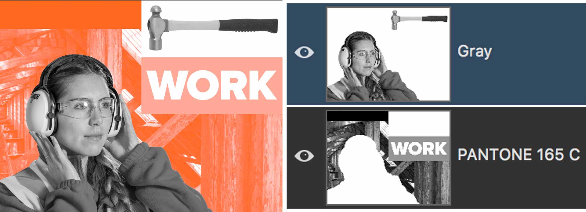
You’ll notice that there is a second layer in the file named Hammer. Turn on its visibility. Notice that the hammers are covered with orange. To reveal the hammers, simply draw a marquee which covers the hammers. Target the Pantone 165 C channel. Fill with white.
When you fill with white on a Spot Colour Channel, it erases the spot colour in the canvas.
Now the hammers should appear in greyscale (with no orange). They will print on the black plate when colour separated.
Full Intensity Spot
Now we will show how filling with black on the Spot Channel actually applies 100% of the Spot Colour in the canvas.
- Draw a Marquee in the small area to the right of the hammer.
- Target the Spot Colour Channel
- Fill with black. See? It fills with solid Orange 165.
Screening a Spot
Now, create a screen of the orange 165 colour.
- Use your Marquee tool to make a slection to the left of the hammer.
- Hit the “D” key to reset your colour swatches to black and white.
- Go to the Colour panel. Enter a value of 20%.
- Target the Spot Colour Channel.
- Fill with the Foreground Colour (20% black)
20% black on the orange spot colour channel will print a 20% screen of Pantone 165 C.
Type on Spot Channels
Type works very differently on spot colour channels, compared to normal type in Photoshop. To start with, it is not vector data. These means that it is way less editable. It also means that there are no font file dependancies with such a file. Let’s try.
- Target the Spot Colour Channel.
- Hit the “D” key to reset your foreground and background colours to black and white.
- Type the word WORK.
- Hit Enter to accept what you typed. Your text is loaded in a marquee which you can move around while the Marquee tool is active.
- Once you deselect, you can no longer edit the text. It is painted in Pantone 165.
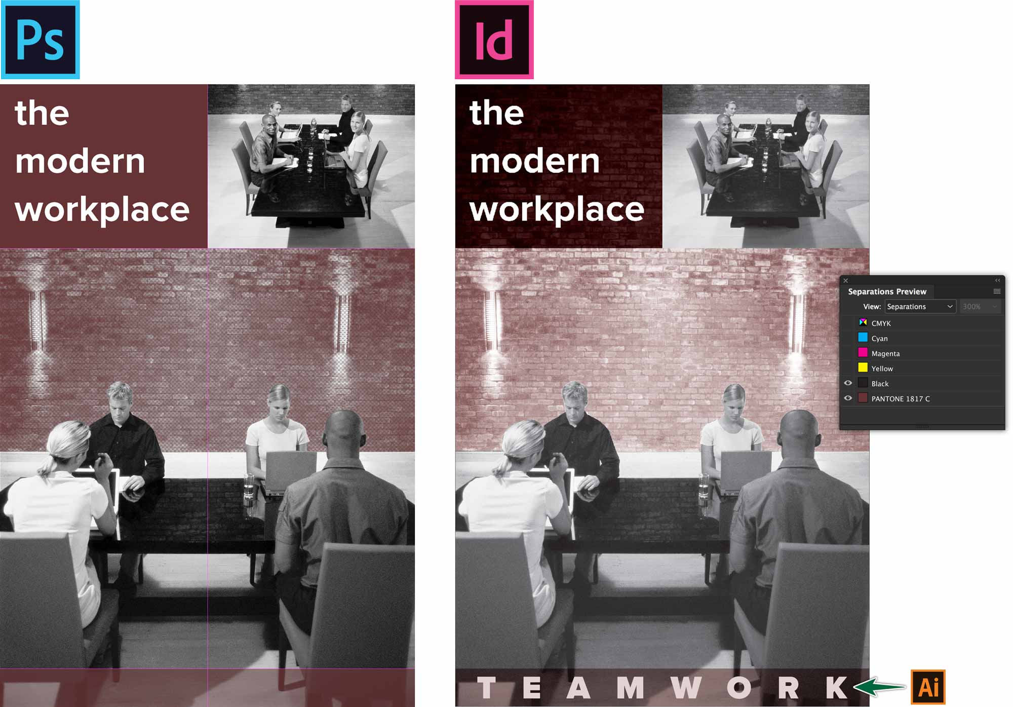
We’re Done! Save this file as a native PSD. Go to InDesign to replace the linked CMYK file with the 2 colour file. You can check your colour break using the Separations Preview panel. Go Window > Output > Separations Preview. Turn off the visibility of all but the black and orange plates. Your ad content should all still be showing on screen.
When you print seps, the file would separate into a black plate and a Pantone 165 plate.
Bump (or Kiss) Plates
Spot colours are not only used in spot colour printing. They can also be used to augment a four colour process print job.

You’ve seen this before, even if you didn’t notice. That advertisement for makeup where the lipstick on the model looks more intense than the rest of the inks in the ad. They’ve likely printed the whole ad in CMYK, then they printed a spot colour only on her lips.
Varnish Plate
The same technique is also used to add a varnish to a photo in Photoshop. Add a spot colour (of any colour), then name it Varnish. This will produce another plate at the printer’s with which they will print the spot varnish over only those areas of the image.
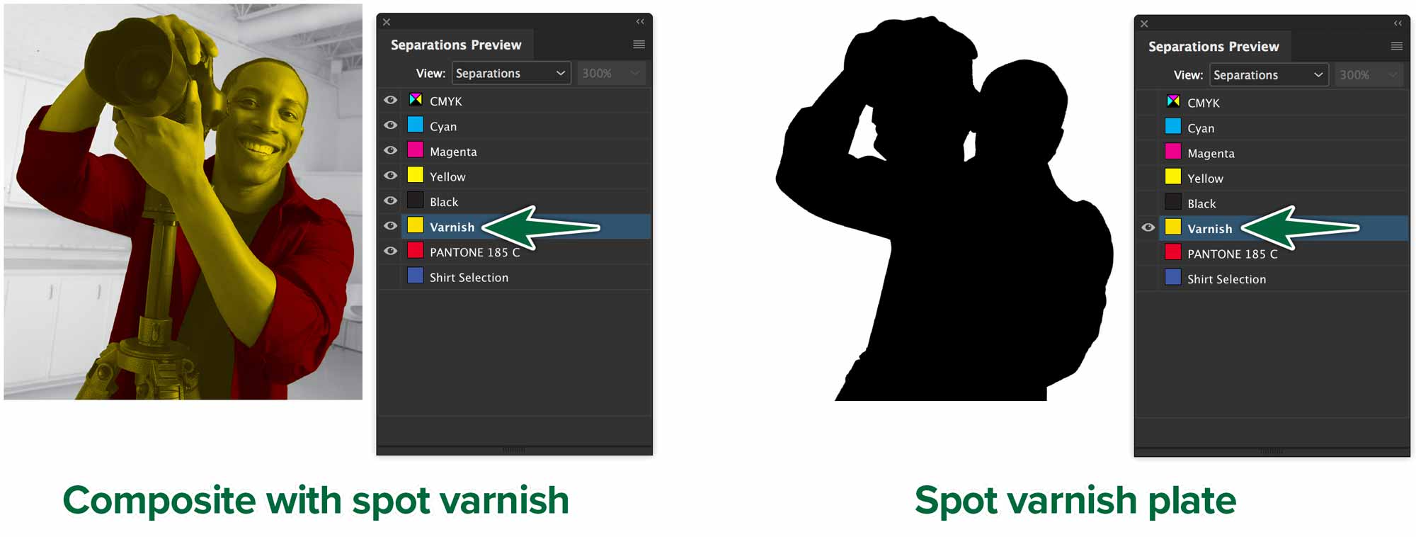
The man in the photo is looking pretty yellow. He’s not going to print that way. That’s our spot colour plate we created to contain the coverage for the spot varnish. The varnish will be applied where the black coverage is in the photo on the right.
Printing Separations
Let’s output our ad to a colour-separated PDF file. Go File > Print…
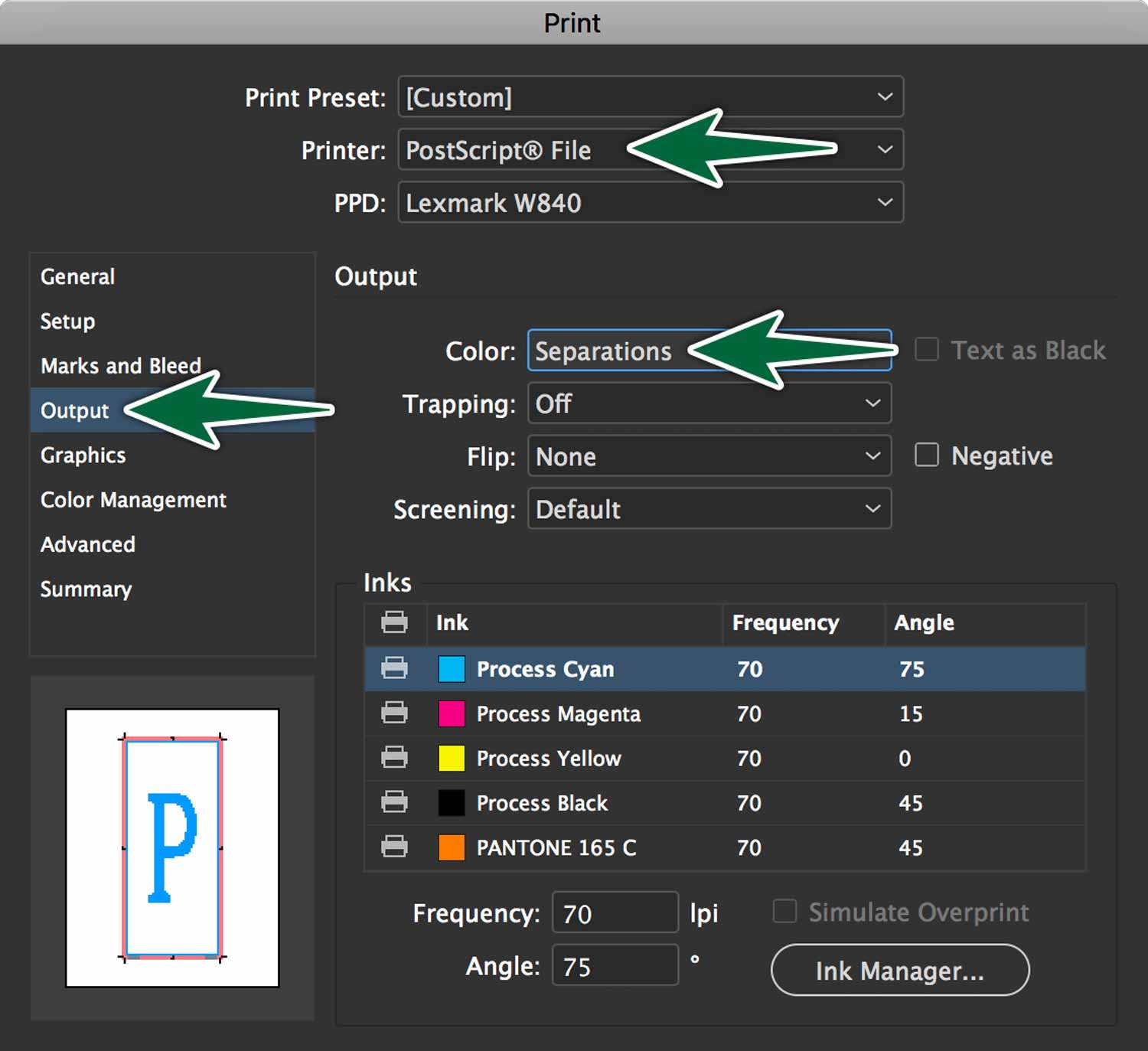
When you click save, it’s going to produce a PostScript (.ps) file. Open it with Preview.app. You’ll see that you have 5 pages. Save it as a PDF file in your project folder.
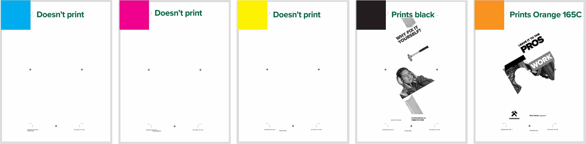
There’s a plate for each of cyan, magenta, yellow, black and Orange 165 C. The first three should have no content on them. When I have a spot colour job, I actually print these on paper. I write on the pages Doesn’t Print and Prints 165C. There will be no excuses if something goes arwry at the printer’s. You’ve covered your bases.
Formative Activity
Convert the provided photoshop file to Black plus Pantone 1817C.
There are guides in the Photoshop file to help you line things up.
Once you’re done, place the ad in the provided InDesign document. Make sure to check the Separations Preview panel to make sure the colour break is correct.
Supplemental Links
- Adobe: Spot Colour Channels
