Topics
Your Assignment
Use the provided images to create a magazine cover design. Magazine covers usually conform to standard layouts due to display racks and other marketing considerations. Yours needs to conform to them, too.
Your layout must adhere to the basic layout shown above. You have the option of placing your model photos in either of the coverline areas. You can place them anywhere inside those areas. The feature photo is the feature photo.
Your Content
Resample
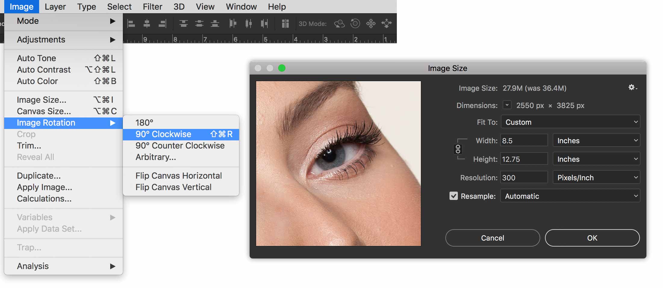
To get started, open the feature model photo. Rotate it using Image > Image Rotation > 90º Clockwise. Resample it to 8.5” wide. Leave the height to whatever it is.

Crop
Crop the image to 11” tall, with Delete Cropped Pixels turned off. This is really the only cropping you should do.
This whole piece should consist of only the provided photos.
The Logo
The logo for the magazine needs to be vector content. Go to Brands of the World to download a magazine logo.
Your logo must be a native Illustrator .ai file.
The logo you download from Brands of the World may be a file format other than a native .ai Illustrator file. If yours is some other format, simply open it in Illustrator to perform a Save As… Illustrator. Use File > Place Embedded to get the logo into your Photoshop file.
Your Text
I’ve provided no text for this assignment. The focus of this magazine is women. Visit women’s magazine web sites to source headlines. If you wish, you could pretend the provided photos are certain celebrities. You can base your text on this assumption.
Font Selection
Use only two font families. One serif and one sans serif. These are a few useful font pairs:
- Futura PT with Kepler
- Proxima Nova with Utopia
- Avant Garde Gothic with Sabon
Feel free to choose your own. You may want to pass your choice by me before you go too far.
Point Type
Use point type for all text but paragraphs. Just click, then type. Do not drag a box. This will be almost all text in this layout.
Area Type
You need to have one instance of area type. This will be a very short paragraph of text. That means that you drag a box.
Layers & Masks
Layers
Name all of your layers. This means even Adjustment Layers. Name them specifically. Blemishes Copy is not even acceptable.
Create layer sets (folders) as required. You shouldn’t have any folders with only one layer in it. They’re there to organize multiple layers.
The best way to get the multiple photos into your main canvas is to use File > Place Embedded….
It’s very important to work in a non-destructive workflow. This means that you do not touch the original photos.
Vector Content
Use the Vector Shape tools to create solid background colours as we did in the Layers assignment a few weeks ago. Avoid using any other techniques to create solid shapes.
Layer Masks
When you position a smaller photo on the left third or elsewhere, make sure you mask it to hide unwanted areas.
The background in the Feature Photo needs to be masked like we did in class.
Retouching
Repair blemishes in a non-destructive manner. Create new empty layers when you clone to remove blemishes, as we did in the previous lesson.
Adjustment Layers
You’re free to use adjustment layers wherever necessary. One requirement is to use them to change the eyes and lips colours of the main model. Be subtle with your edits.
Have fun and good luck!


