Topics
Why Trapping?
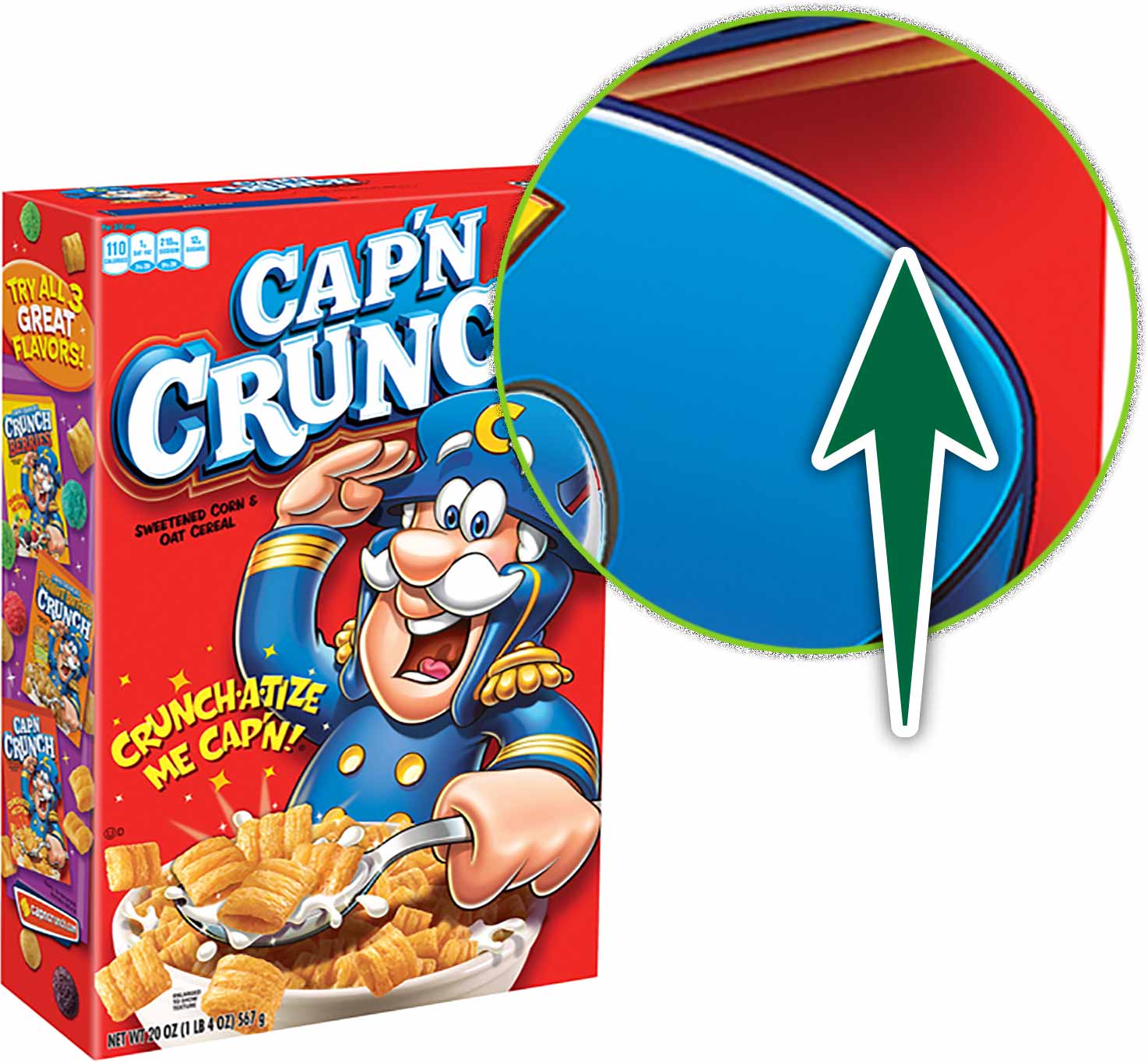
While I was eating my Cap’n Crunch cereal this morning, I found myself entranced by the artwork on the box. I was focused on a small area of the front. I noticed that where two contrasting colours met, they seemed to overlap to create a darker colour band all along that intersection.

Cereal boxes are printed with a unique printing method called Flexography. This is a lower-cost printing method that excels at printing large areas of solid colour.
This blue ink and red ink are each spot colours. They have no colour in common. So, if registration were off on the press, there would be a risk that an unisightly gap could appear between the shapes.
This happens because inks with no colours in common knock out of each other. In the image below, if you were to remove the yellow circle, there would be a hole in the cyan square. When do colours knock out? When they don’t have an ink in common.

Above, on the right, we have pure yellow and pure cyan. They have no colours in common. This means that the cyan square prints with a hole in it. They yellow is then printed to fit the hole. Therein lies the problem. The yellow will almost never line up perfectly with the hole. This is why we need trapping.

Above, on the left, both shapes contain some cyan. The green circle contains 30% cyan. You can see that when the cyan is printed, there is no hole in it. Then yellow is simply printed on top. There’s no opportunity for a gap between the shapes.
Trapping on large printed surfaces with a poor quality printing process like the cereal box make the overlap visible to the naked eye. You often see the same effect on packaging. Trapping shouldn’t be visible to the naked eye with higher quality printing.
How Trapping Works
There are a few settings that can affect the intensity of the trap. There’s the weight of the stroke and the tint reduction. The weight of the stroke is pretty obvious. The weight of the stroke dictates the size of the overlap of the light colour on top of the dark colour. Tint reduction is how faded the lighter colour is where it overlaps with the darker one.
Creating a Trap
Supplemental Links
- Adobe: Trapping


