Topics
You’ve most certainly encountered a problem with inconistent blacks when having your homework printed at a service bureau, like the College’s Print Shop or a UPS outlet. You get a really dark black in places, then a greyish black in other regions.

What we’re looking at on the left, the dark black, is Photoshop’s default black, which is:
C: 75%
M: 67%
Y: 67%
K: 100%
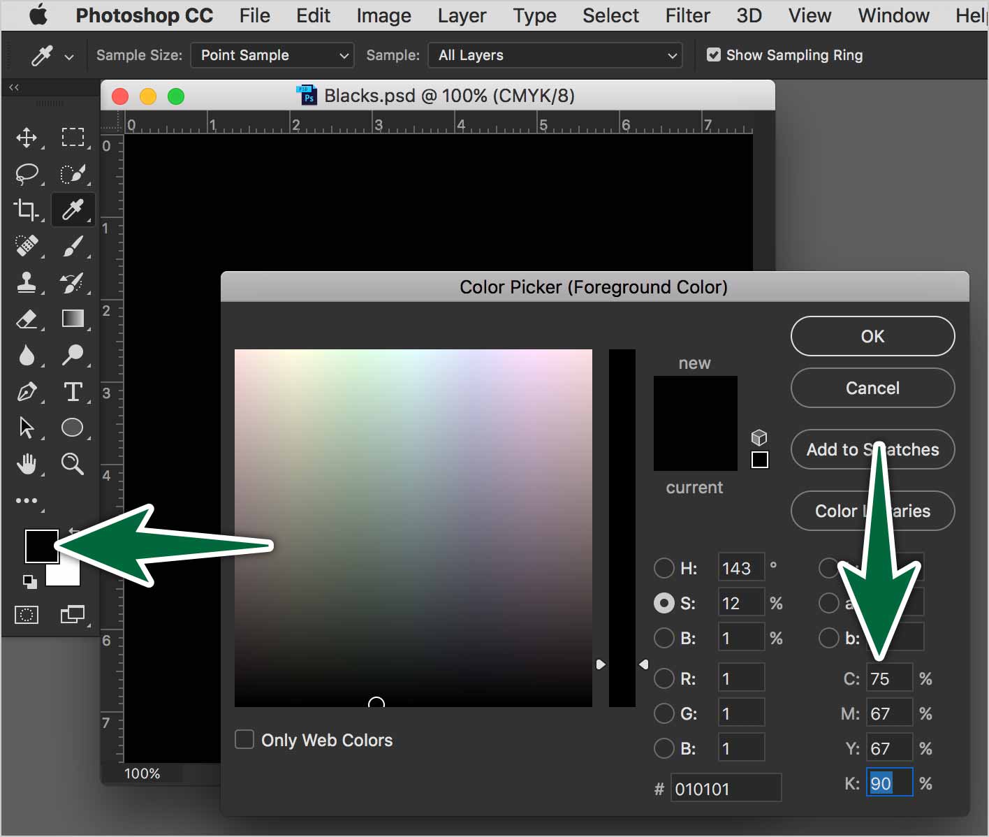
This is the black you get when you hit the D key to set Photoshop’s default colours. You should avoid using this black in your work.. It may take too long to dry, it may smudge or it may have a colour cast.
When we add some of the other process colours with black, the result is called a rich black. There are many recipes for rich blacks. If you want to use a rich black, ask your printer which numbers they prefer to use.
On the right above is InDesign’s or Illustrator’s black. In CMYK, it’s:
C: 0%
M: 0%
Y: 0%
K: 100%
Herein lies the problem. If you apply Photoshop’s default black, then place that image in InDesign or Illustrator next to its default black, they won’t match.
Appearance of Black
You can control what the various blacks look like in Illustrator and in InDesign. Go to Preferences > Appearance of Black… Choose to display and output all blacks accurately in both apps. This way, you can see and control the numbers for your blacks.
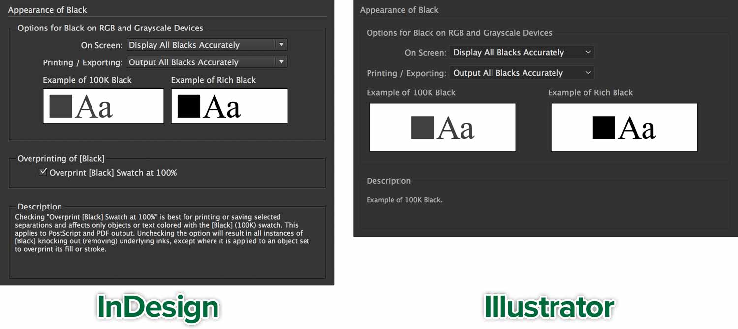
This way you’ll be able to distinguish black recipes on screen. You’ll get in print what you see in the apps.
Your Intent
To find the solution to your specific circumstance, you need to know what the intent of your file is.
Black for Text
When setting body copy, make sure you only use 100% K. If you use a mix of CMYK inks, it will be very difficult for the printer to get those inks to print lined up exactly. This is called registration (of the four inks), and it’s very difficult on fine lines.

See how cyan, magenta, yellow and black inks don’t line up properly. This poor registration is caused by the paper shifting while running through an offset press. See how the 100% K black is sharp.
Going to Press
If you’re printing at a commercial printer’s their presses won’t render a dark black with only 100% K. It looks even more washed out when printing on un-coated stock. Consult with them to get their rich black recipe to achieve a truly black black.
Use those numbers across all your design applications. One good idea to get consistent blacks is to add the swatch you want to use to your Creative Cloud Library panel, then it’s accessible from all your Adobe apps.
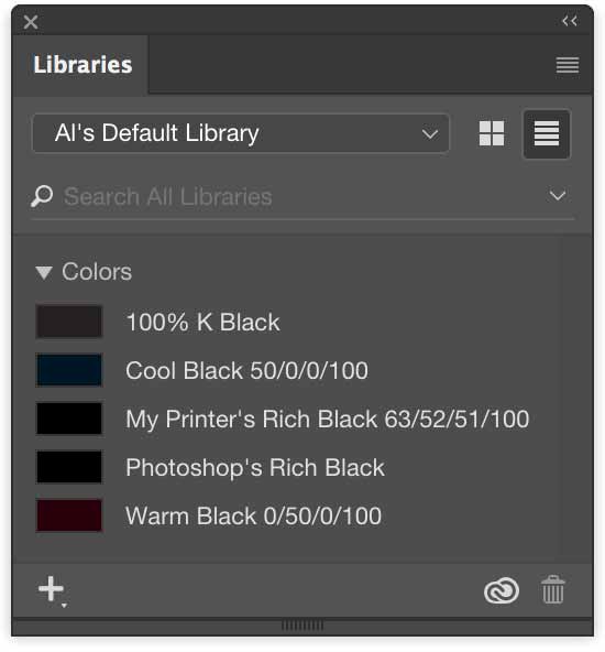
You can clearly see the difference in the appearance of the various blacks in the panel above.
To the Print Shop
If you use the same ink numbers in different apps, you should obtain the same results. If you don’t, it could be caused by the printer drivers in the laser or inkjet printer. You should show your print job to the printer to resolve the issue. Try printing a test sheet with all the different blacks on it to see how the printer interprets them.
Conclusion
You need to plan ahead while you’re working to use the same numbers for black in all of your applications.
Tips
- Ask your commercial printer which black to use to achieve the look you want.
- Save recipes for various blacks in your Creative Cloud Library panel for quick access.
Supplemental Links
- Adobe: <a href=”https://helpx.adobe.com/indesign/how-to/print-black.html” alt:=”Adobe: How to print blacks.” target=”_blank”>Printing Blacks</a>