Topics
About Channels
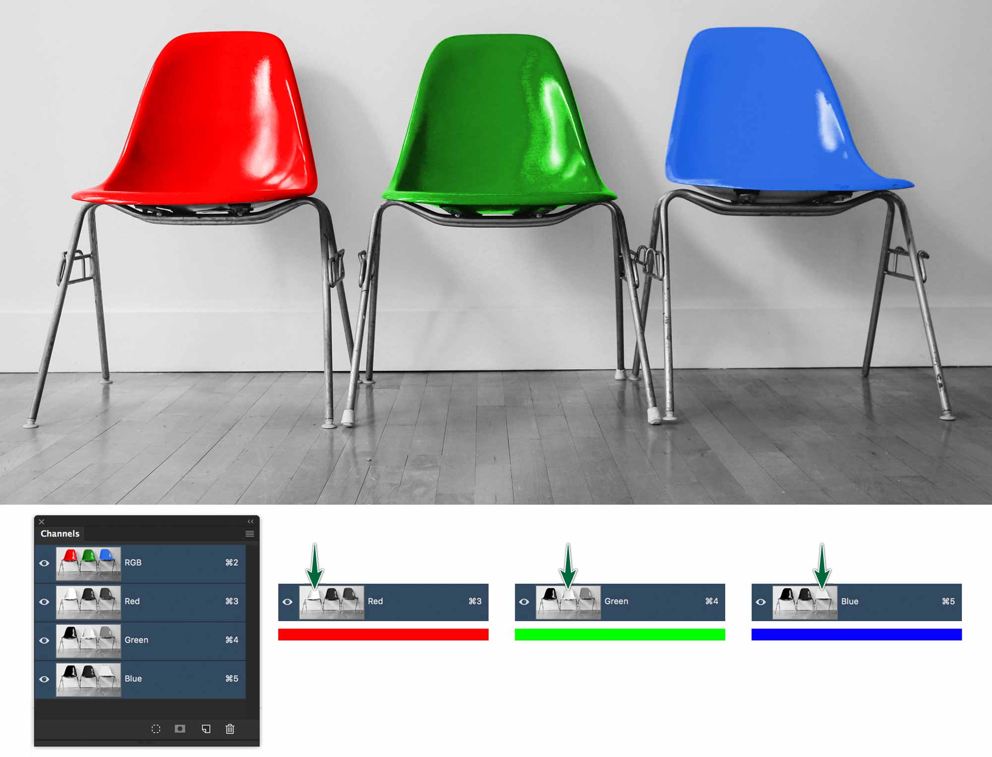
Channels in RGB
Despite Photoshop’s awesome colour manipulation capabilities, it’s actually colour blind. It really only understands greyscale images. An image is composed of three stacked greyscale images called channels. The lighter the grey on the Red channel, the more intense the red will be in your photo.
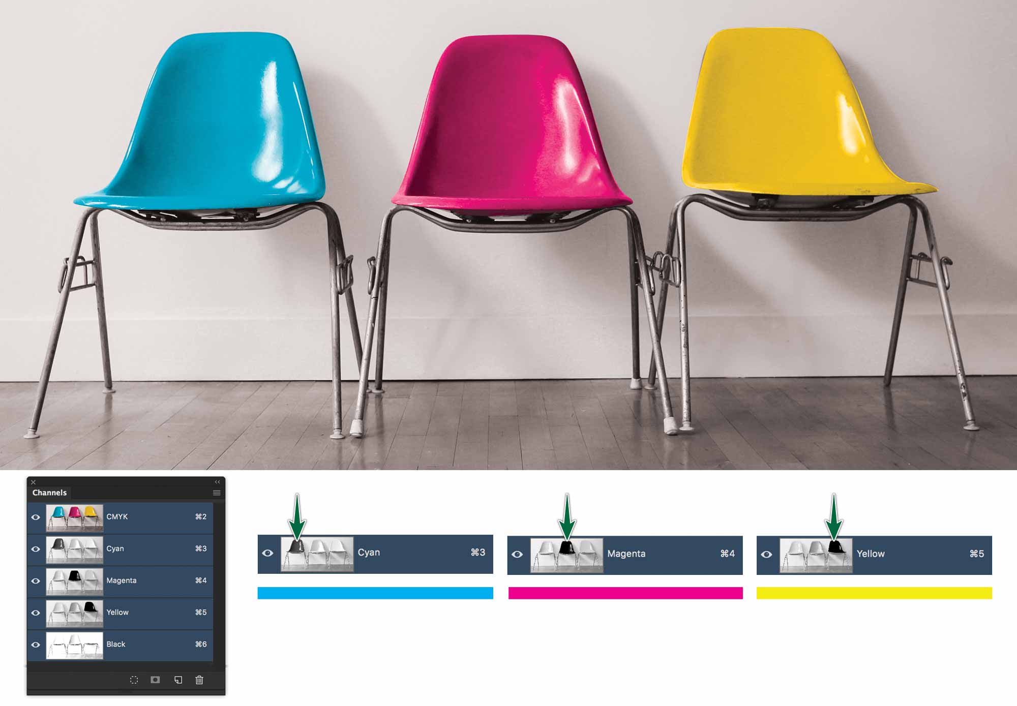
Channels in CMYK
The very definition of a CMYK image is that it has four channels. One for each of Cyan, Magenta, Yellow and Black. Everything else being equal, CMYK files are larger than RGB files for that reason.
Why a Duotone?
A duotone is a Photoshop greyscale image printed with a spot colour ink. There are a few reasons to use a duotone.
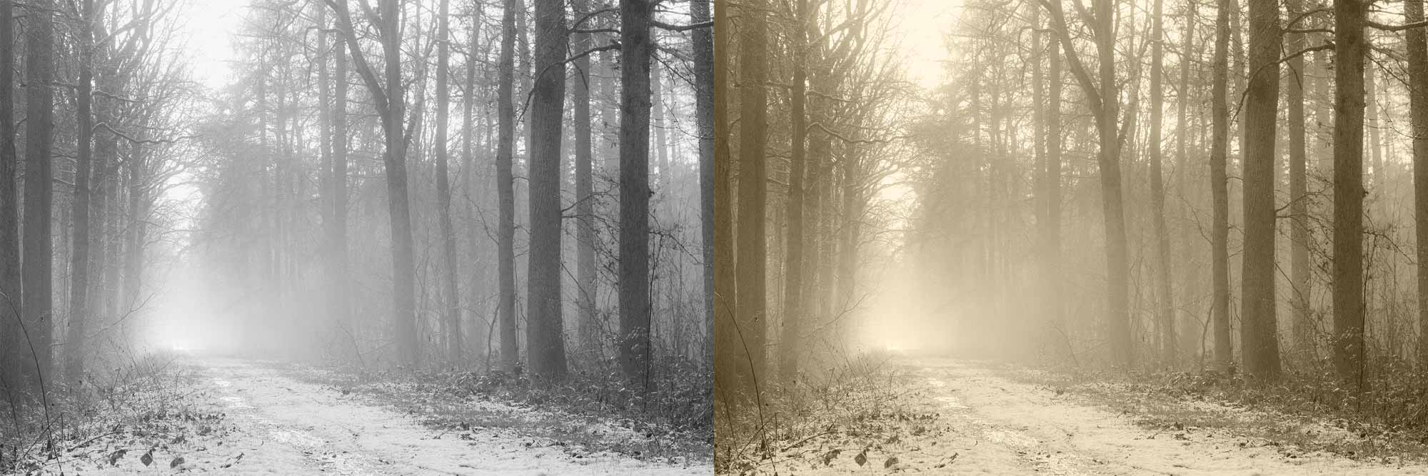
You may be printing a two spot-colour job. In this case you can apply both of your inks to a photograph rather than just printing it in greyscale. Be aware that this may not always yield great results, depending on the ink combination you’re using.
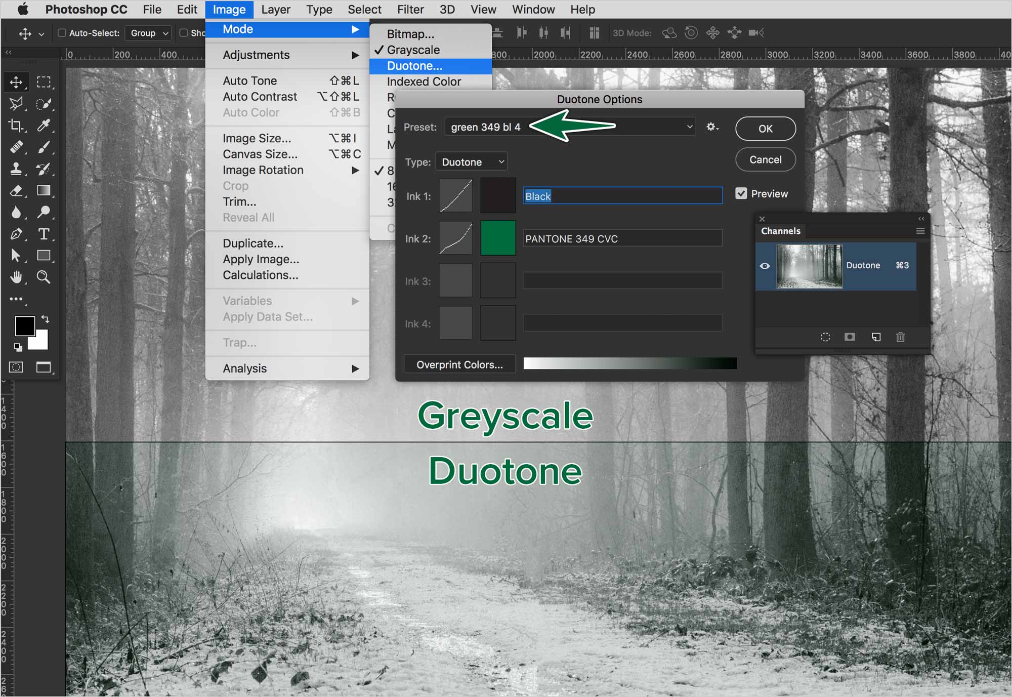
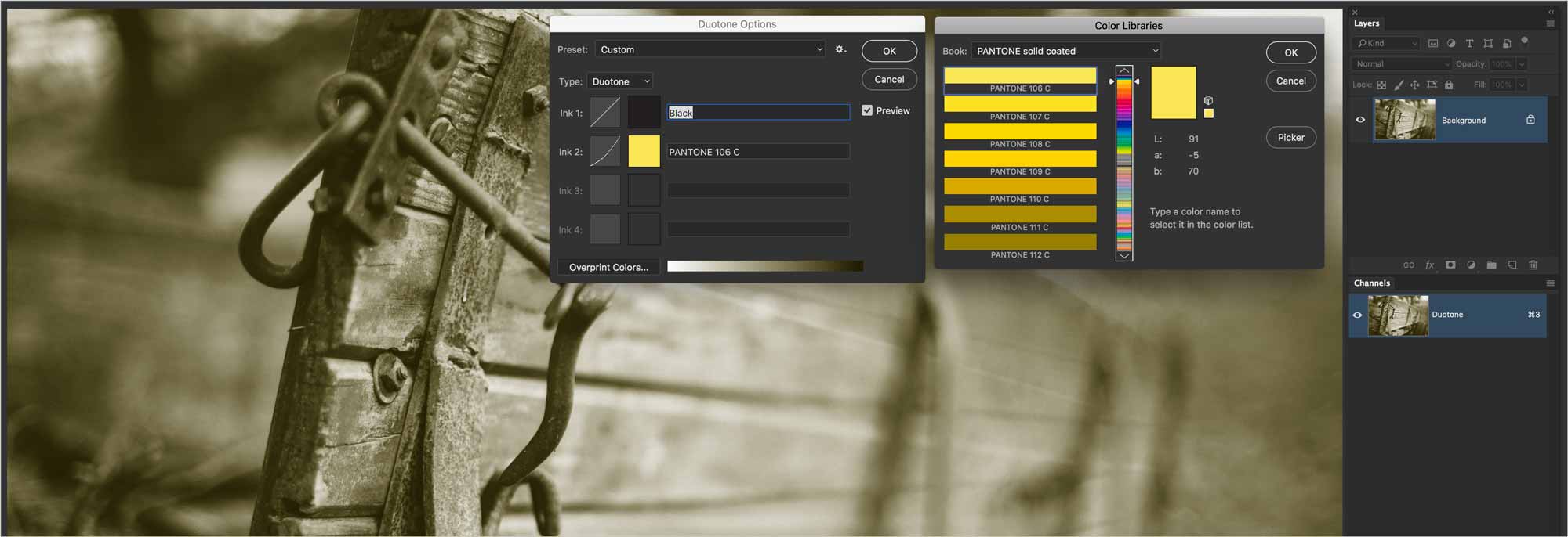
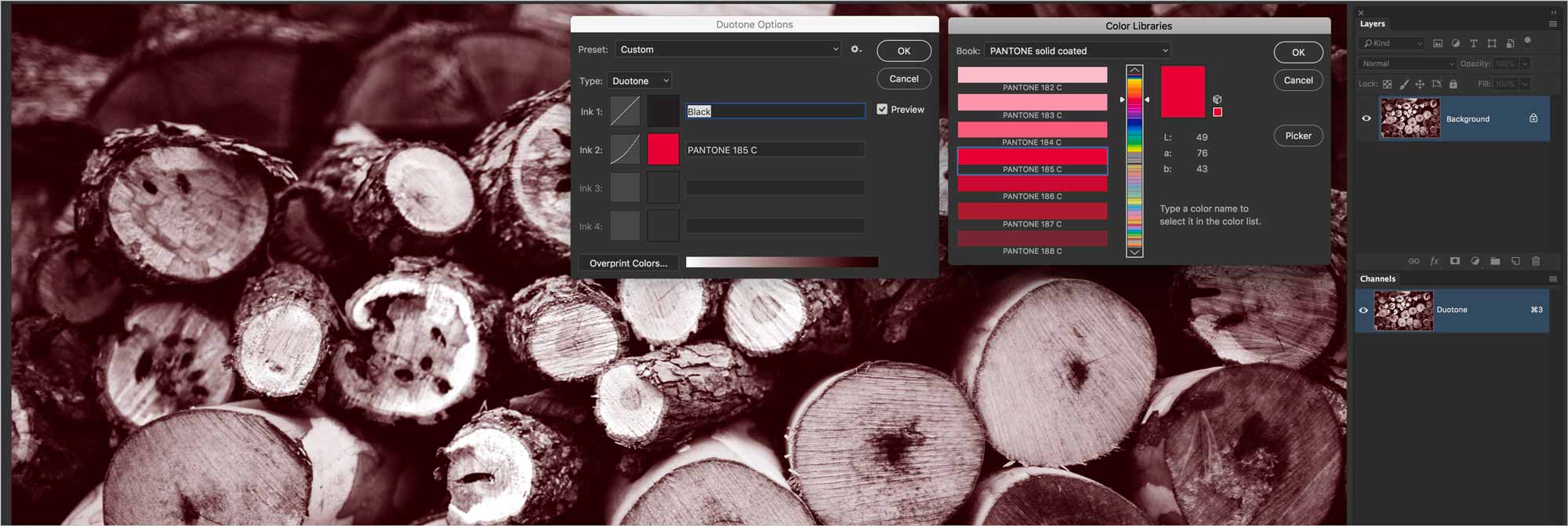
Creating a Duotone
The first step in creating a duotone image is to convert it to greyscale mode. You can simple use Image > Mode > Greyscale. This won’t give you any control of the conversion process.
If you do want to adjust the tonality of your photo as you convert it, it’s better to start with a Black & White adjustment layer first.
Once we have the adjustment layer set, we can then use Image > Mode > Greyscale to convert the image.
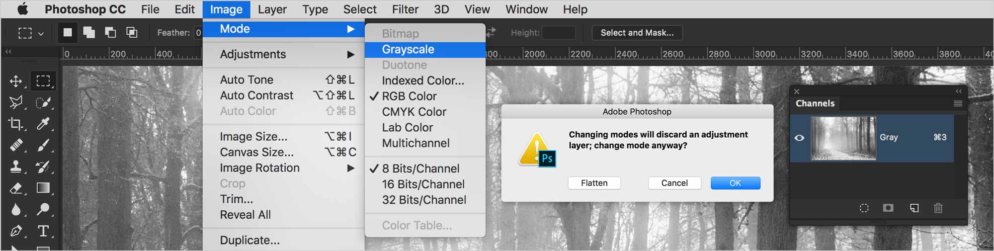
Once you convert to greyscale, you’ll end up with a flattened photo in the Layers panel. You’ll also notice that there’s only one Gray channel in the Channels panel.
Editing Duotones
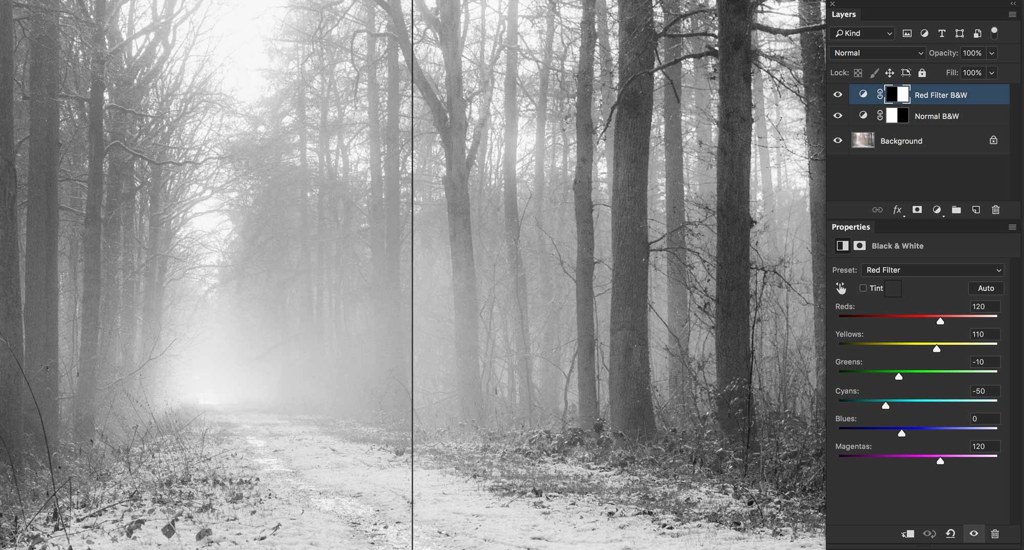
After you’ve created a duotone image, it is possible to edit how the inks are mapped across the photo.
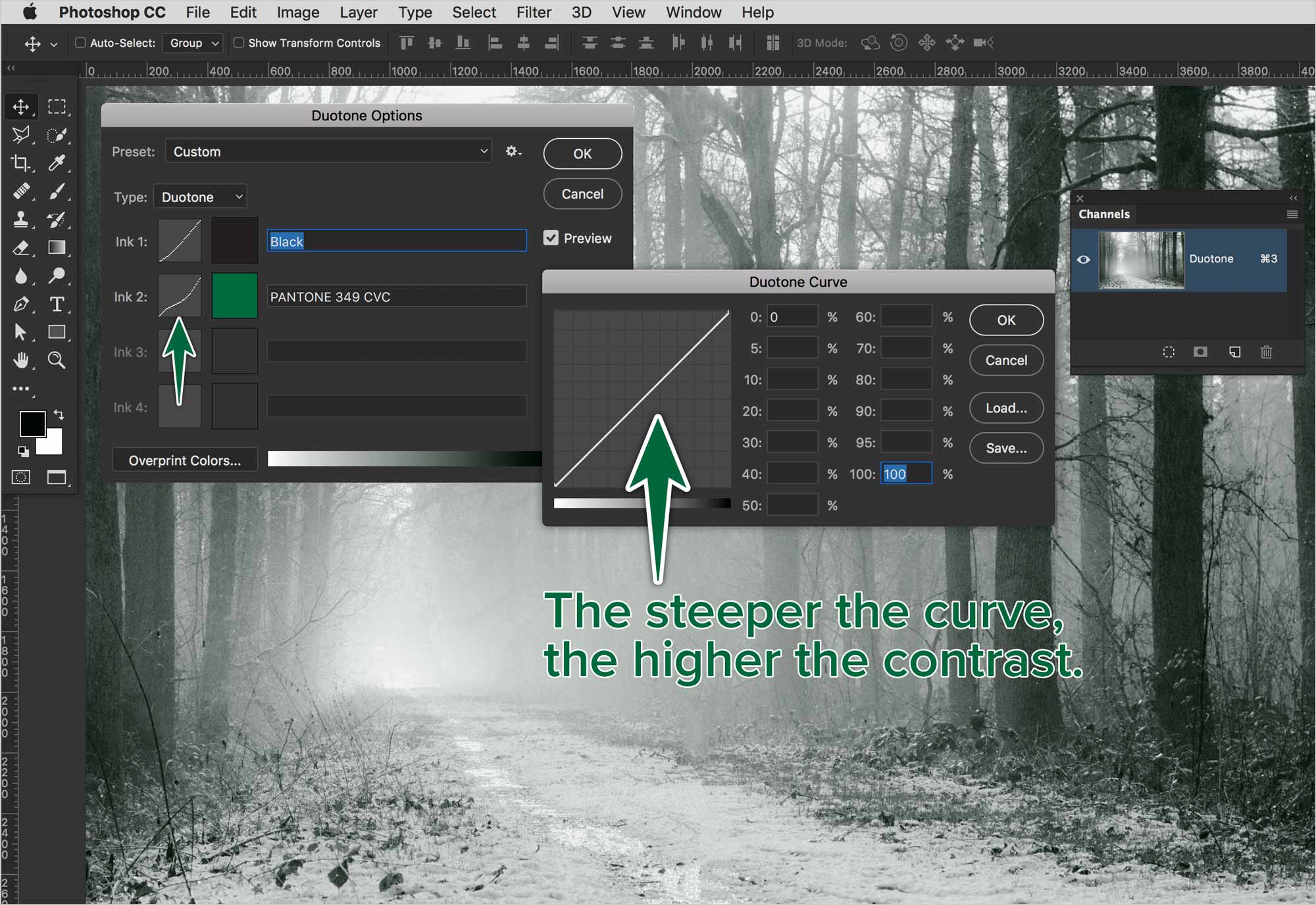
In this photo, the press will print this photo with black ink, then it will print Pantone 349 CVC on top of the black. The distribution of inks is based on each colour’s curves.
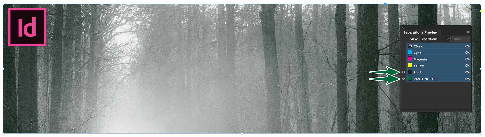
Using Duotones
If you place your duotone mode file in InDesign, you can see the colour break with the Colour Separations panel.
Faux Duotones
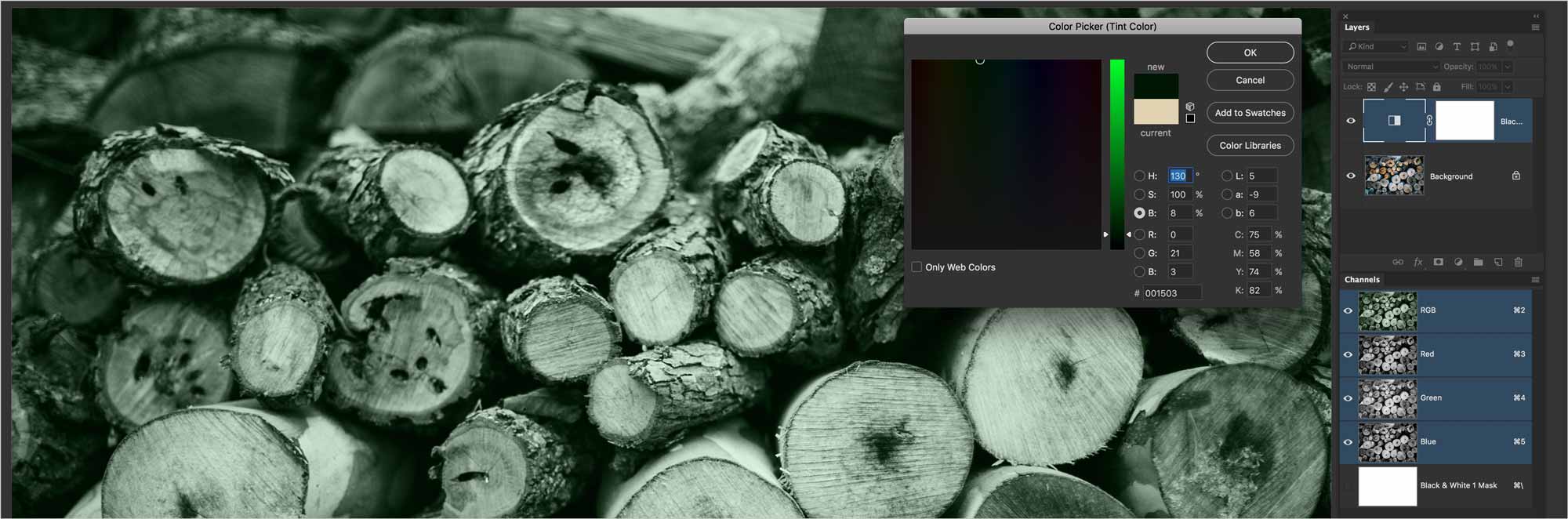
These images have he appearance of a duotone, but are really in full colour. All you need to do is open your RGB image in Photoshop, then add Black & White adjustment layer to it.
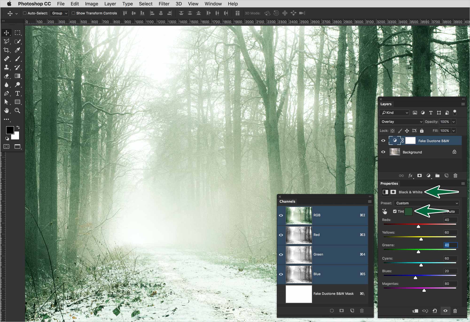
This is a faux duotone. As you can see, the Channels panel still shows the image is in RGB. It has three channels rather than the one a duotone image would have.
Formative Activity
You’re going to convert each of the provided photos to a true duotone mode. Make a faux duotone with the second version of the photo.
Supplemental Links
- Behance: Examples of Duotones
