Algonquin College Graphic Design Program Computer Graphics Course Curriculum Algonquin College Graphic Design Program Computer Graphics Course Curriculum

Duotones

Apps Used: Adobe Photoshop Adobe InDesign

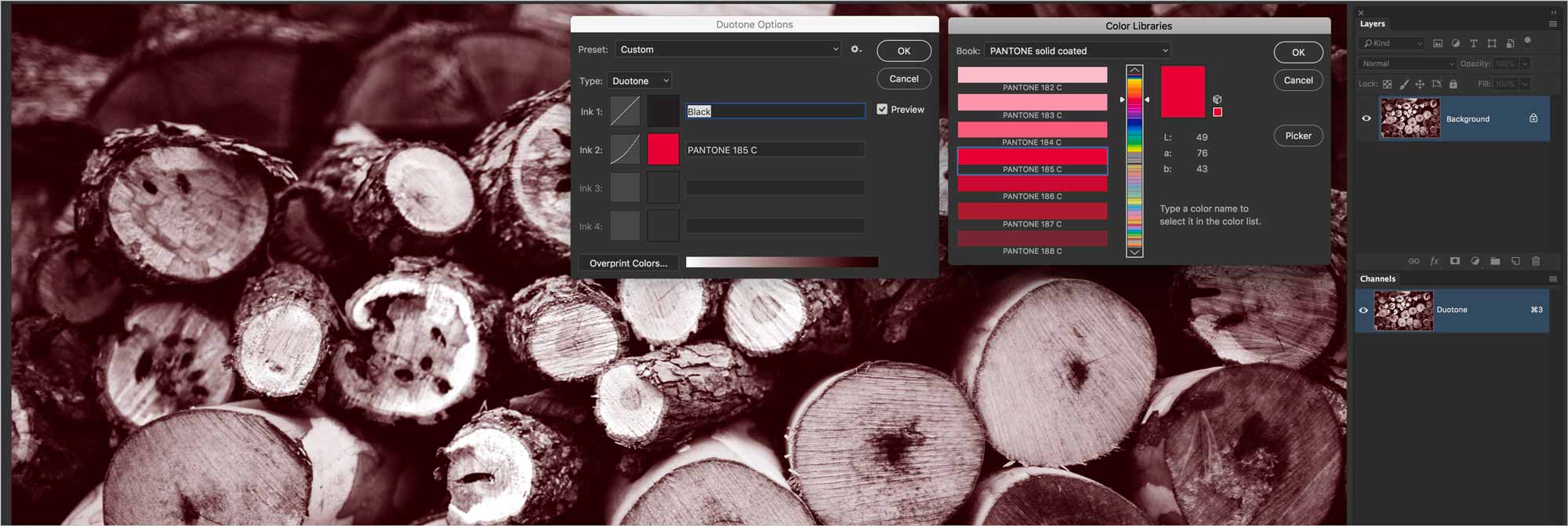
A duotone Photoshop image is a greyscale image printed with a coloured ink rather than with black ink. You can obtain striking results with a well thought-out production strategy.

This is a formative assignment

That means that you'll be learning and practising new software skills. This assignment contributes to your final grade in the course. This work will be graded as either:

Complete Incomplete

If needed, I will provide written feedback on your performance.

Topics

About Channels

Channels in RGB

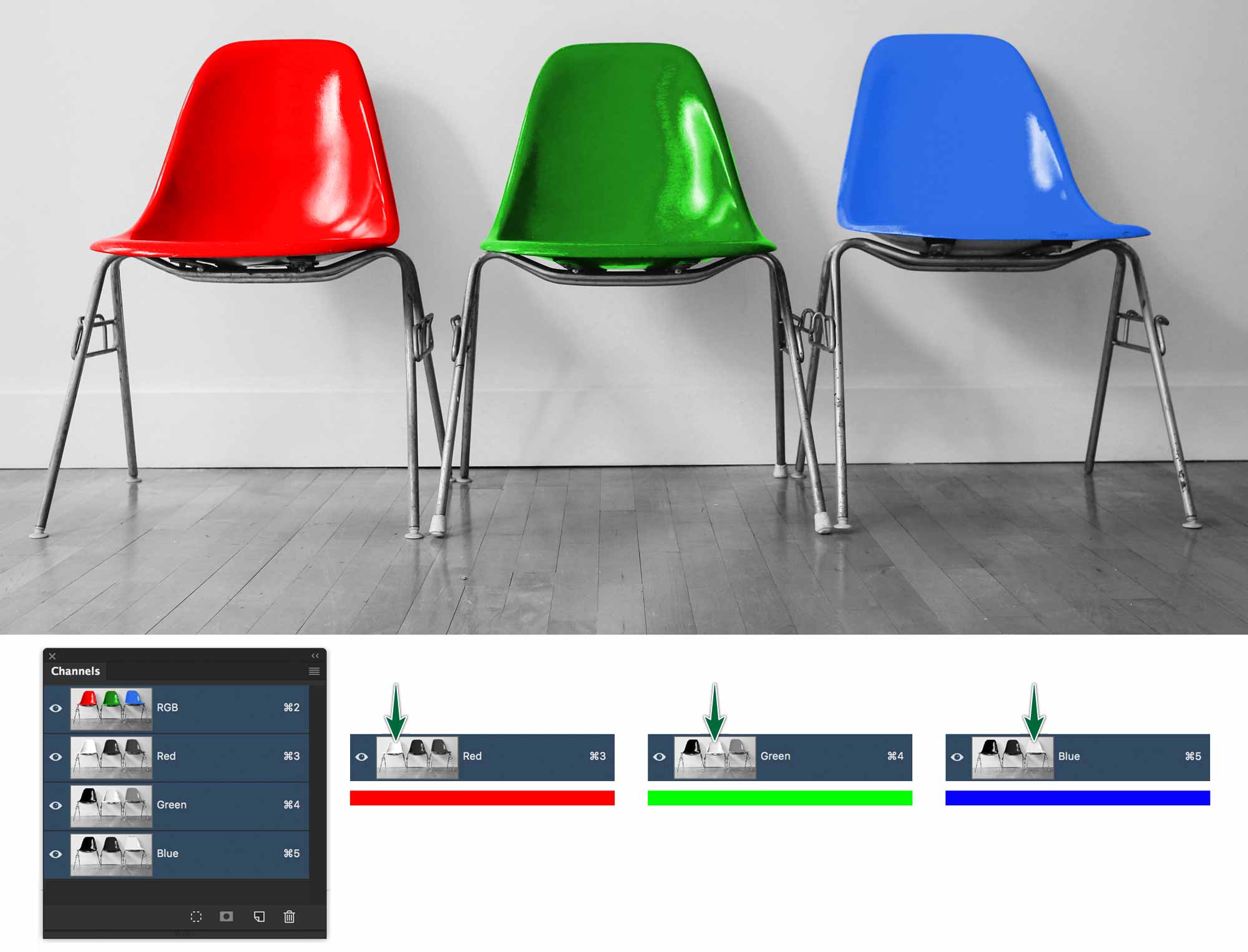
Despite Photoshop’s awesome colour manipulation capabilities, it’s actually colour blind. It really only understands greyscale images. An image is composed of three stacked greyscale images called channels. The lighter the grey on the Red channel, the more intense the red will be in your photo.
duottone-channels-rgb
You can see in the image above that the darker the pixels on a given channel, the *less* intense that colour is in your photo. It's like the light's are out over that part of the image.

Channels in CMYK

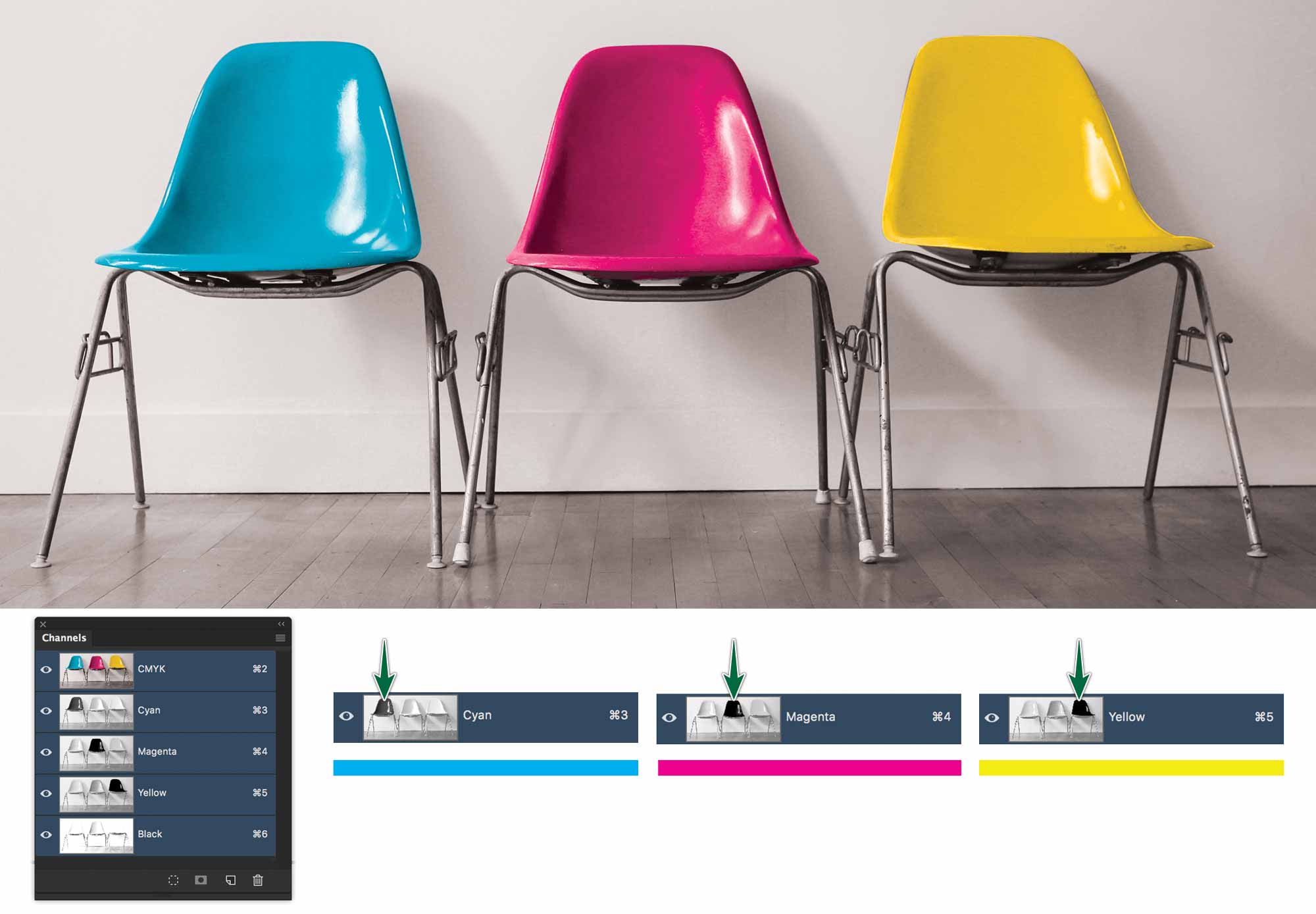
The very definition of a CMYK image is that it has four channels. One for each of Cyan, Magenta, Yellow and Black. Everything else being equal, CMYK files are larger than RGB files for that reason.
duotone-channels-cmyk
Channels work the same way in CMYK, except the light values are reversed. The printer will lay down more ink where the channel is dark.

Why a Duotone?

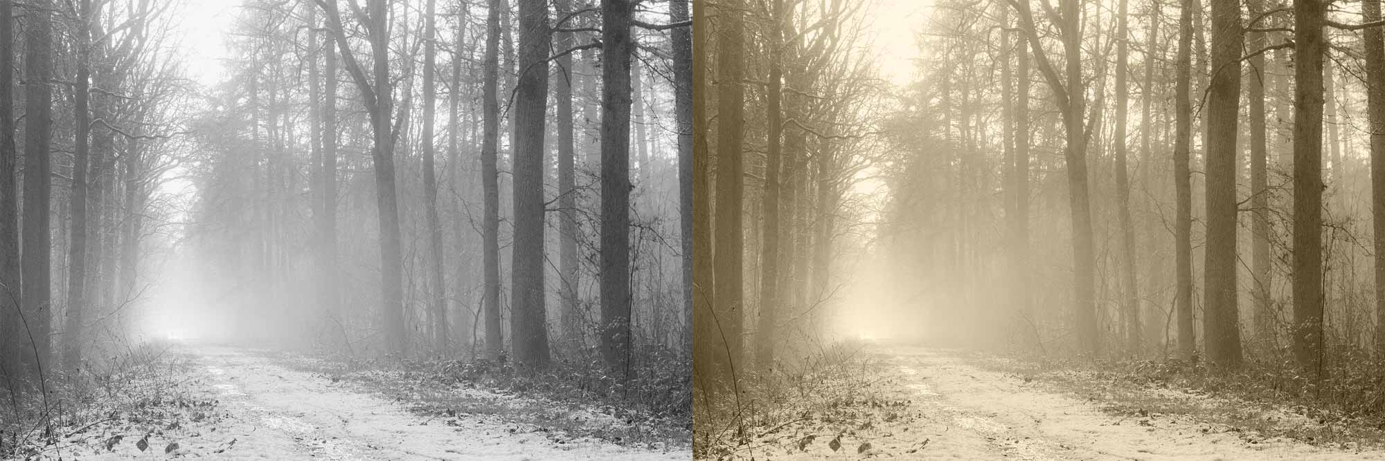
A duotone is a Photoshop greyscale image printed with a spot colour ink. There are a few reasons to use a duotone.
duotones-compare-to-greyscale
You can see in the image above that the duotone on the righ is much more interesting than the greyscale image on the left.

You may be printing a two spot-colour job. In this case you can apply both of your inks to a photograph rather than just printing it in greyscale. Be aware that this may not always yield great results, depending on the ink combination you’re using.

Creating a Duotone

The first step in creating a duotone image is to convert it to greyscale mode. You can simple use Image > Mode > Greyscale. This won’t give you any control of the conversion process.

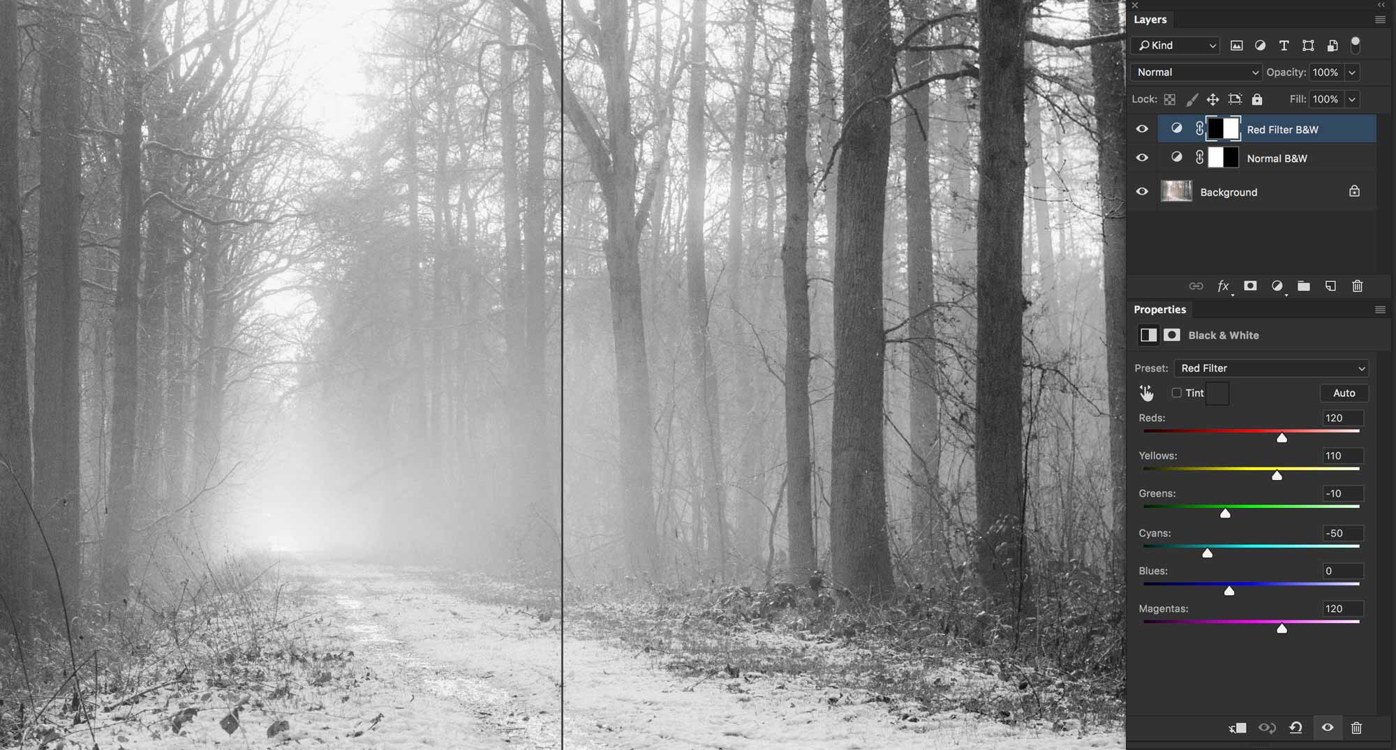
If you do want to adjust the tonality of your photo as you convert it, it’s better to start with a Black & White adjustment layer first.
duotones-compare-greyscales
You can see that the right side of the photo has richer tones, due to the Red Filter black & white setting that's applied to that half of the photo. It's superior to the flatter part of the photo on the left, which is a normal greyscale conversion.

Once we have the adjustment layer set, we can then use Image > Mode > Greyscale to convert the image.

duotones-convert-to-greyscale
Convert to greyscale and flatten.

Once you convert to greyscale, you’ll end up with a flattened photo in the Layers panel. You’ll also notice that there’s only one Gray channel in the Channels panel.
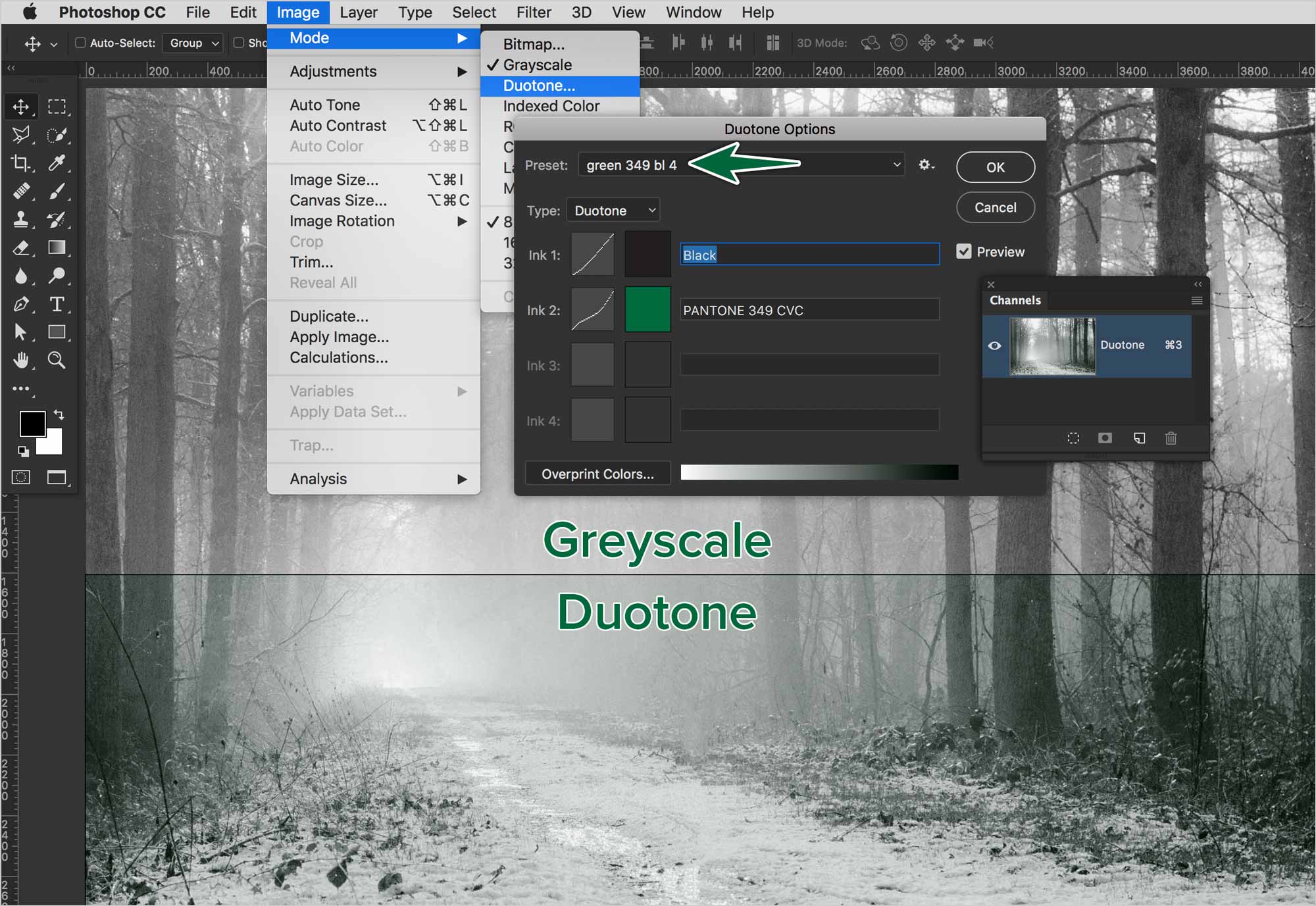
duotones-make-duotone-green
This image offers a before & after comparison between the greyscale and duotone mode areas.

Editing Duotones

After you’ve created a duotone image, it is possible to edit how the inks are mapped across the photo.
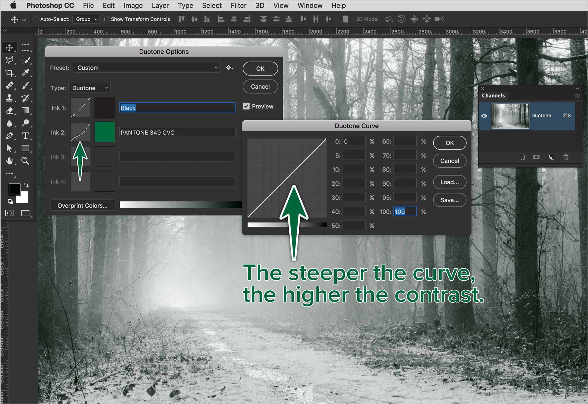
duotones-edit-duotone-curves
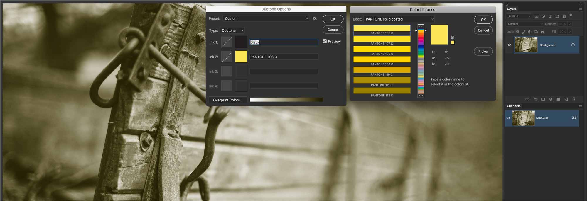
All you need to do to edit your duotone curves is to go back to Image > Mode > Duotone... Click on one of the curve icons to edit it.

In this photo, the press will print this photo with black ink, then it will print Pantone 349 CVC on top of the black. The distribution of inks is based on each colour’s curves.

Using Duotones

If you place your duotone mode file in InDesign, you can see the colour break with the Colour Separations panel.

duotones-in-indesign
A duotone image placed in InDesign. You can see how the two colours contribute to the photo from the Separations Preview panel.

Faux Duotones

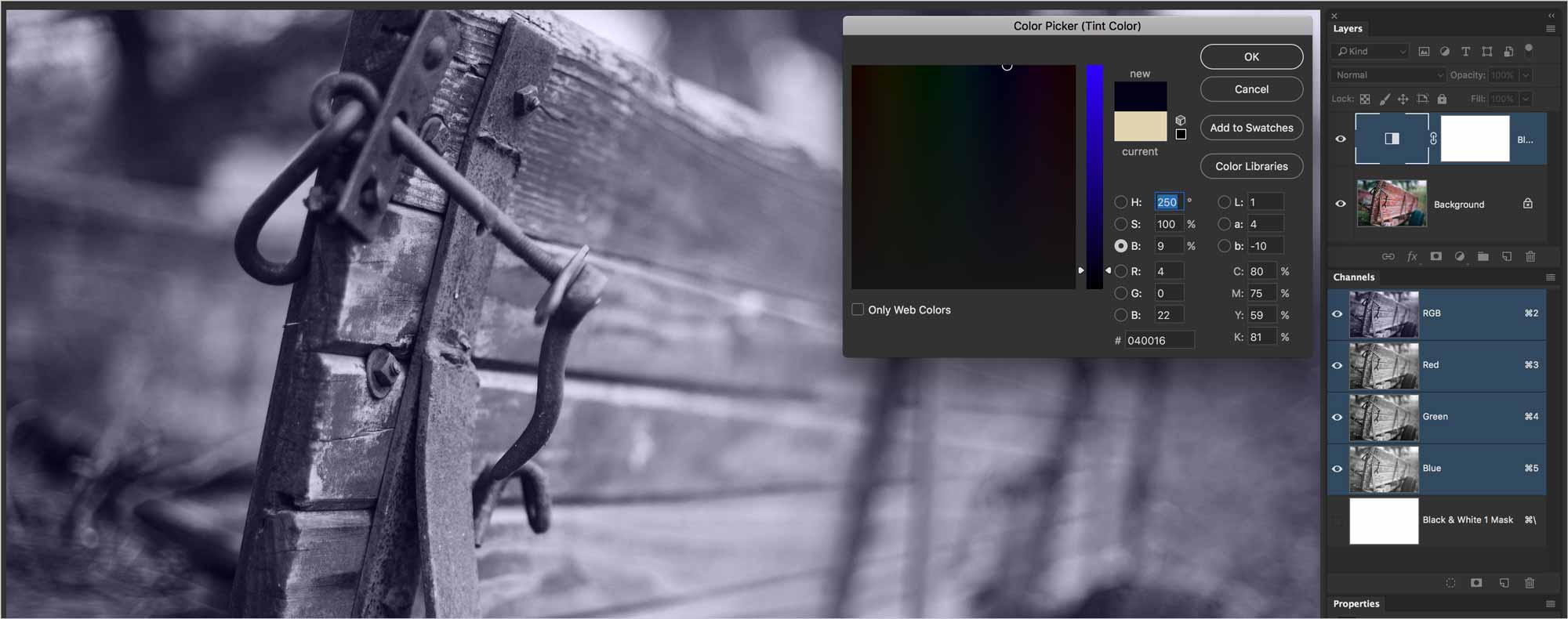
These images have he appearance of a duotone, but are really in full colour. All you need to do is open your RGB image in Photoshop, then add Black & White adjustment layer to it.
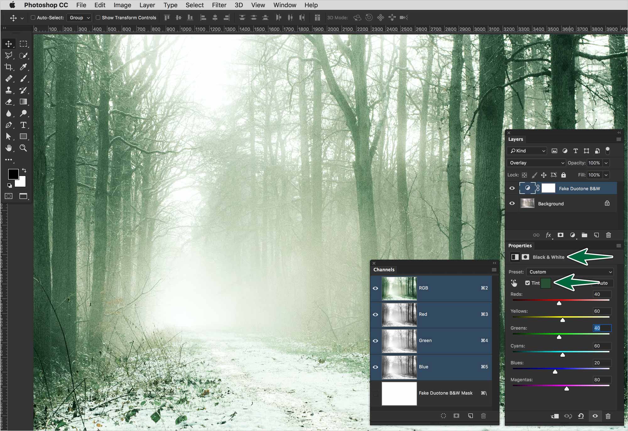
duotones-fake-duotone
In the Black & White adjustment layer's Properties panel, you can edit the tint of the image to get the desired effect.

This is a faux duotone. As you can see, the Channels panel still shows the image is in RGB. It has three channels rather than the one a duotone image would have.

Formative Activity

You’re going to convert each of the provided photos to a true duotone mode. Make a faux duotone with the second version of the photo.
01-duotone-real
This is a real duotone. It has a single channel. Choose the colour you want. Ajust the curves as you see fit.
02-duotone-fake
This is a faux duotone. It's still in RGB colour mode. Add a Black and White adjustment layer. Use the colour of your choice. Adjust the curves as you see fit.
03-duotone-real
This is a real duotone. It has a single channel. Choose the colour you want.
04-duotone-fake
This is a faux duotone. It's still in RGB colour mode. Add a Black and White adjustment layer. Use the colour of your choice.

Supplemental Links

What you'll submit:

Instructions

Make sure your InDesign document is named LastName-FirstName-#-Assignment-Name. # is your group number So,

Appleseed-Johnny-1-Duotones.indd

Check your font usage to only include Adobe Fonts. To do so, go Type > Find Fonts . There should only be Adobe Fonts in the list.

Check your image usage in the Links panel. Make sure there are no warning icons in the panel.

Once this is done, save your document, then package it using File > Package . The resulting folder will already be named properly. Zip-compress the folder by right-clicking on it, then choosing Compress... .

Appleseed-Johnny-#-Duotones.zip

Failure to submit your files as directed will incur a proportional loss of points. If your file/folder is not named with your name, you will earn a zero. Why?