Topics
Appearance
Artwork in Illustrator can have solid fills, gradient fills, pattern fills, solid strokes, gradient strokes, transparency, etc… All these attributes combined make up the artwork’s appearance. We should apply these attributes using the Appearance panel. This gives us one place to see and to edit all the object’s attributes.
The Appearance Panel should be open at all times while you’re working in Illustrator. It actually saves screen space to keep it open, because other panels are included within it. The Stroke Panel is a good example. There’s a complete Stoke panel inside the Appearance panel.
Object Type Indicator
Whenever you have something selected in Illustrator, the Object Type Indicator displays what type of object it is.
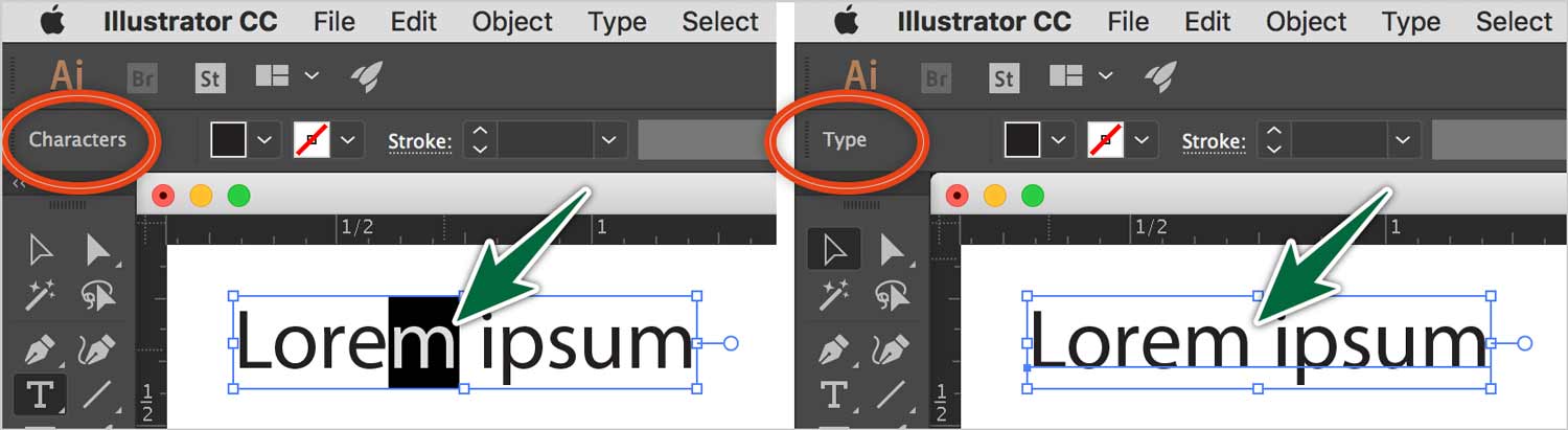
In the image above, you can see that Illustrator treats selected characters as a type of object and point type as a different kind of object. One is called Characters and one is called Type. Well, all attributes in Illustrator can be targeted for styling. Some of the various object types include:
- Layer
- Path
- Shapes like Ellipse, Rectangle, etc…
- Characters
- Type
- Group
- Compound Paths
- Anchor Point
- Placed Image
- Gradient Mesh
- Mesh Point
- etc…
You target any of these attributes for styling in the Appearance panel. The Appearance Panel is like layers for the attributes of your artwork. Each item in the panel corresponds to an element of the selected object. The Object Type Indicator tells you what you have targeted and what will be affected in the Appearance Panel.
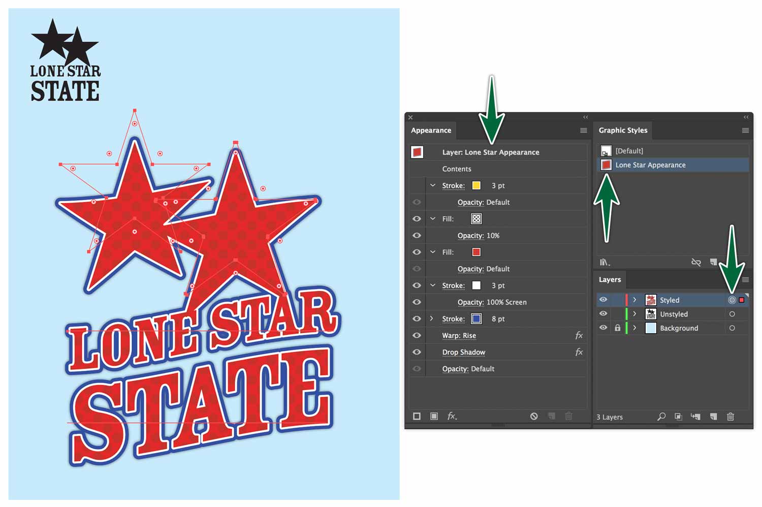
In the image below, the layer is targeted, then the blue fill and stroke is applied. This gives this appearance to everything on the layer. You can achieve the same effect by grouping the shapes, then targeting the group for styling.
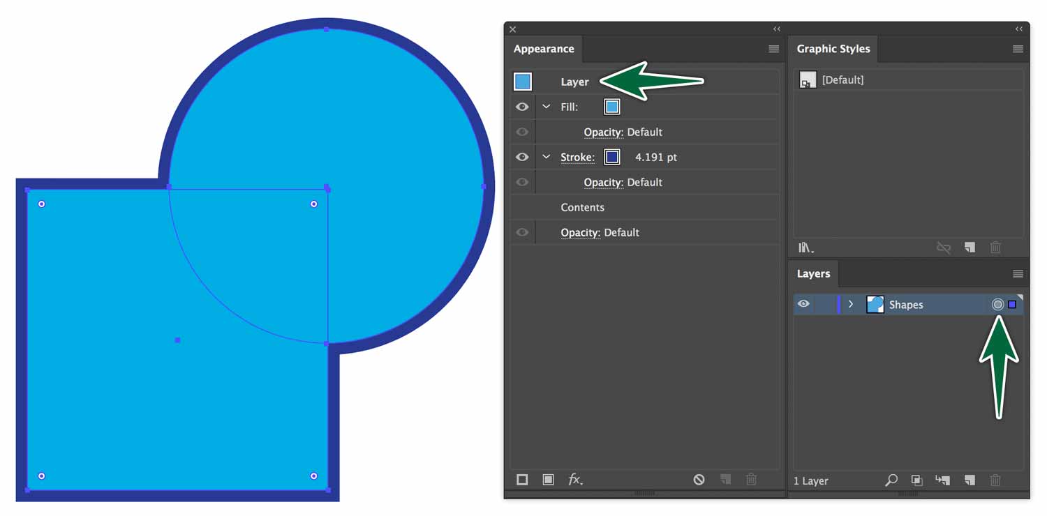
To target a whole layer for styling, click on the larger circle to the right of the layer’s name. When you target a whole layer, then apply appearance attributes, everything you draw on the layer gets those attributes. The shapes even look like they merge together. The only condition is that the stroke needs to be below the fill in the Appearance panel.
Opacity and Blend Modes
The Appearance Panel also controls the opacity and blends modes for each attribute of your object. So you can set a stroke to have a 50% opacity on an object with a solid fill.

You can also change the blend mode of that attribute.
Effects
You can access the Effects menu from the bottom of the Appearance Panel. It’s the little Fx along the bottom of the panel. This is the same menu as the actual Effects menu in the menu bar.
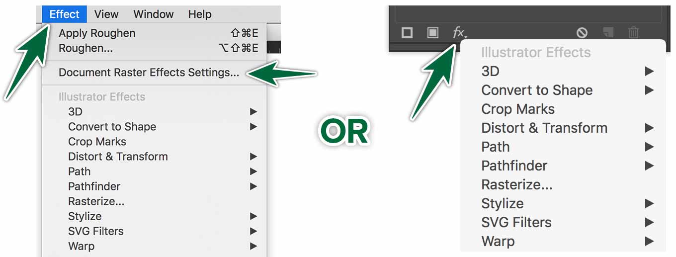
There are some effects which are pixel-based. Note that when you use a pixel-based effects, the settings are dependant on the resolution of the file. Your Illustrator document’s resolution settings are set from Effects > Document Raster Effects Settings….
If settings are at 72 dpi, a given drop shadow would be big. If settings are at 300 dpi, the same drop shadow will look smaller, or sharper.
Object > Pattern > Make
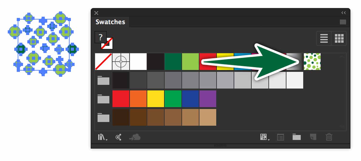
Illustrator has a built-in tool for creating a pattern. There’s a whole panel devoted to it. This is dead-simple to use. Create the artwork for one tile of your pattern. Drag it to the Swatches panel. This will automatically create a pattern swatch.
The initial artwork dimensions will dictate the tile’s size, so make that size what you want it to be before adding it to your Swatches panel. Once the swatch is in the panel, you can double-click on it to edit it in the Pattern Options panel. This is where things get interesting.
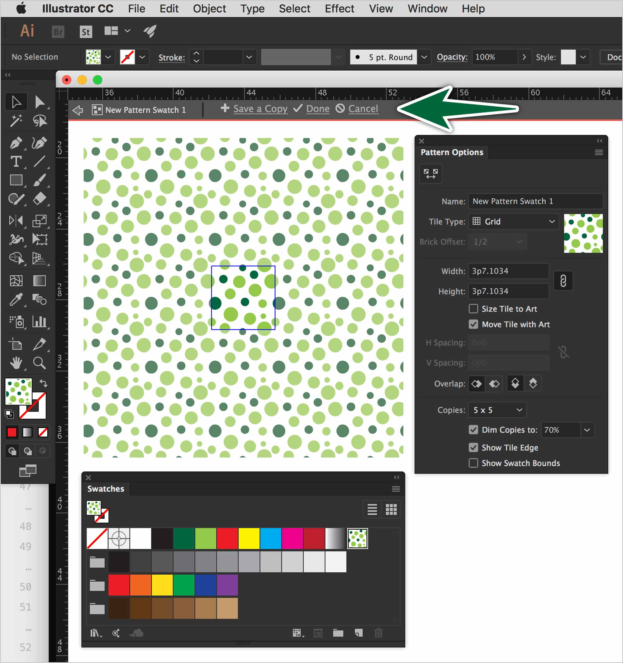
The settings here will depend on the type of pattern you’ve made. Note that you can edit the pattern, then choose Save a Copy in the isolation bar. This is really great for iterating or making variations on a pattern.
The Pattern Panel
The Tile Type sets how the tiles are positioned relative to each other.
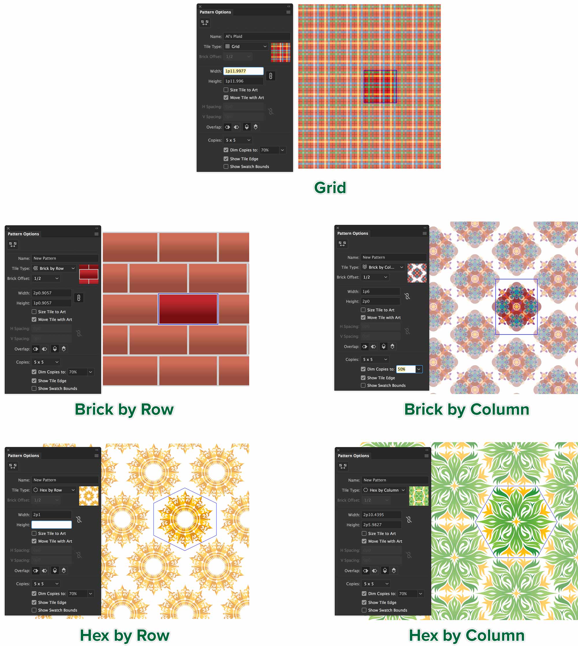
- Grid
- The tiles are placed in a square grid. The centers of the tiles align vertically and horizontally. This works well with square initial art.
- Brick by row
- Tiles are rectangular. Horizontal centers are aligned. Tiles are vertically offset.
- Brick by column
- This is the same as Brick by Row, but in a vertical arrangement. The tile is vertical.
- Hex by column
- Tiles are hexagons and arranged in columns. Tiles in the columns are aligned.
- Hex by row
- Tiles are hexagons and arranged in rows. Tiles are aligned.
- Brick Offset
- Determines the offset either vertically or horizontally, depending on the Tile Type you’ve chosen.
- Width / Height
- Determines the size of the tile. You can create gaps between tiles, or make them overlap.
- Size Tile to Art
- This attaches the size of the tile to the artwork. As you edit, if you scale the artwork, the tile will scale, too.
- Move Tile with Art
- Attaches the tile to the artwork. If you move the artwork, the tile moves with it.
- H Spacing / V Spacing
- Determines the size of the spacing between tiles.
- Overlap
- When tiles overlap this determines which tiles appear in front.
The bottom part of the panel has nothing to do with the actual pattern production. It sets what the preview of the pattern looks while you’re producing it.
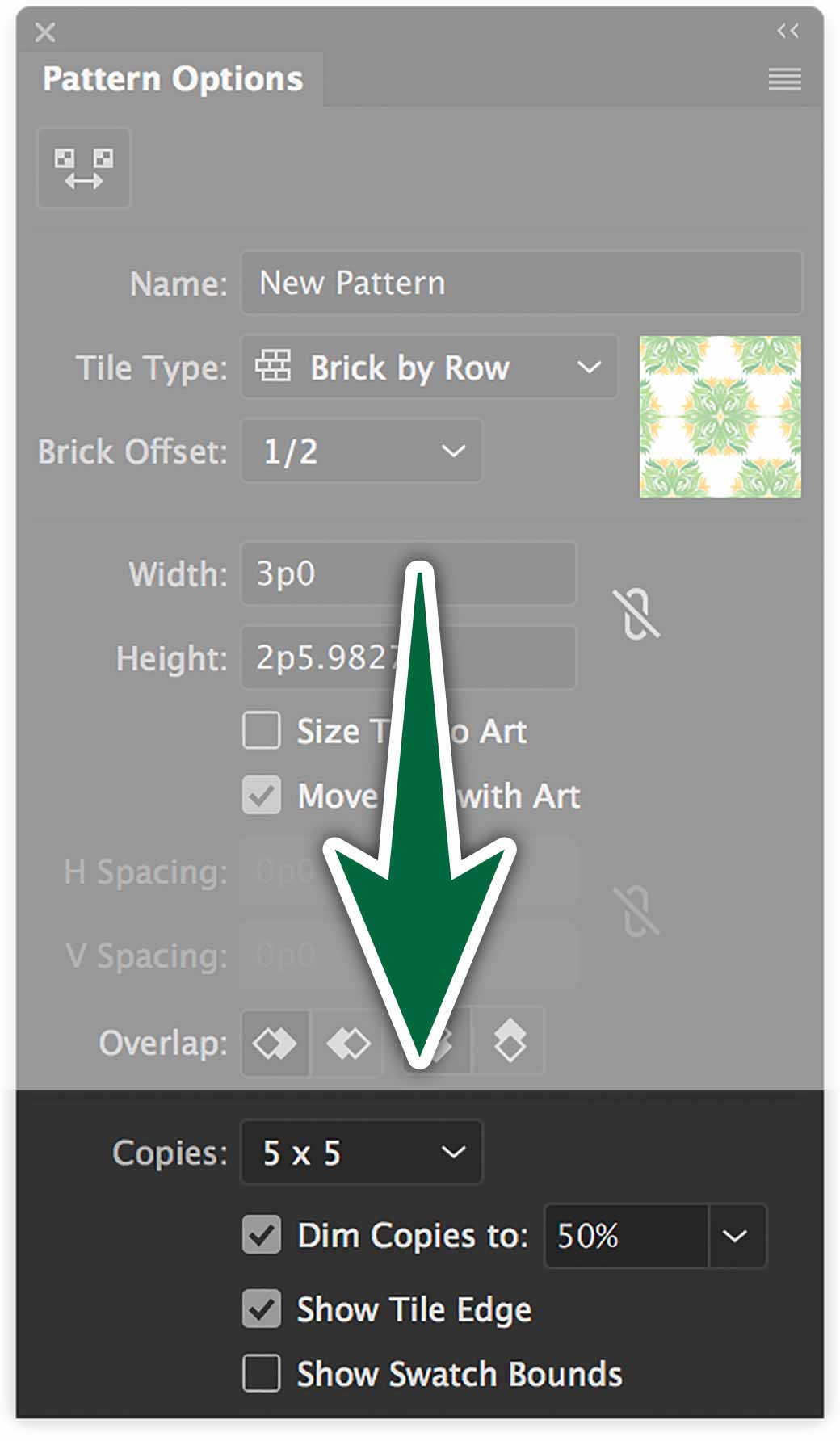
- Copies
- Determine how many rows and columns of tiles are visible while modifying the pattern.
- Dim Copies
- Determine the opacity of copies of the artwork tile previewed while modifying the pattern.
- Show Tile Edge
- Select this option to display a box around the tile.
- Show Swatch Bounds
- Select this option to display a unit portion of the pattern that is repeated to create the pattern.
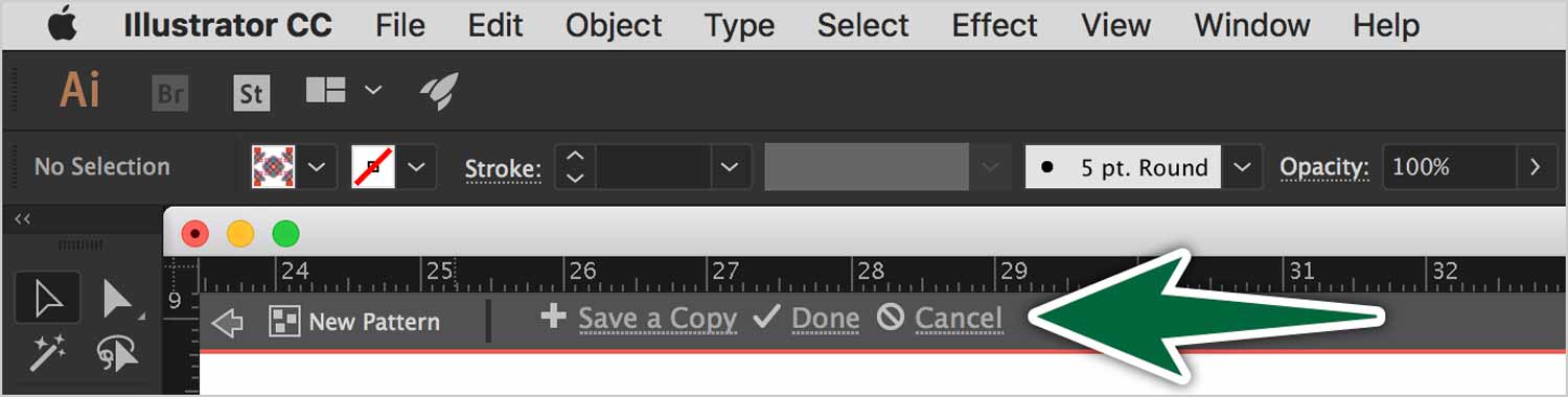
In the grey bar below the Control Panel, choose to save or discard changes to the pattern.
Start From Nothing
You can use the Make Pattern function starting from no artwork. This is pretty cool. Go Object > Pattern > Make… The panel will come up, with a tile preview on the page. Now you can draw in the square. Illustrator will generate a live preview of your pattern as you draw it. I told you it was cool.
Transforming Patterns
There are two options when scaling an object that has a pattern in it. You can have the pattern scale or not.
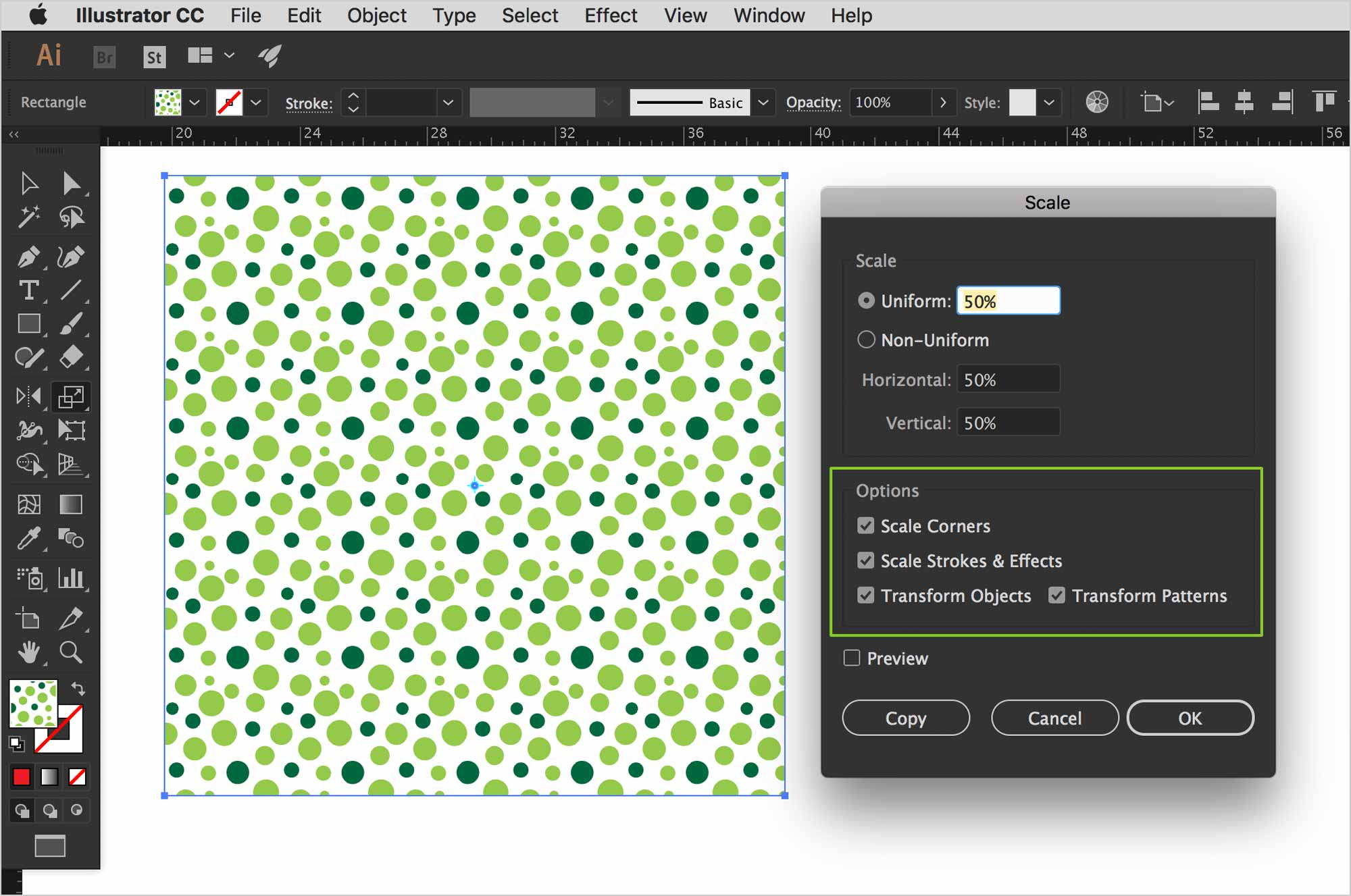
All you need to do is double-click on the scale tool. Choose the options you want. Most of the time, we want patterns to scale with the shape they’re in.
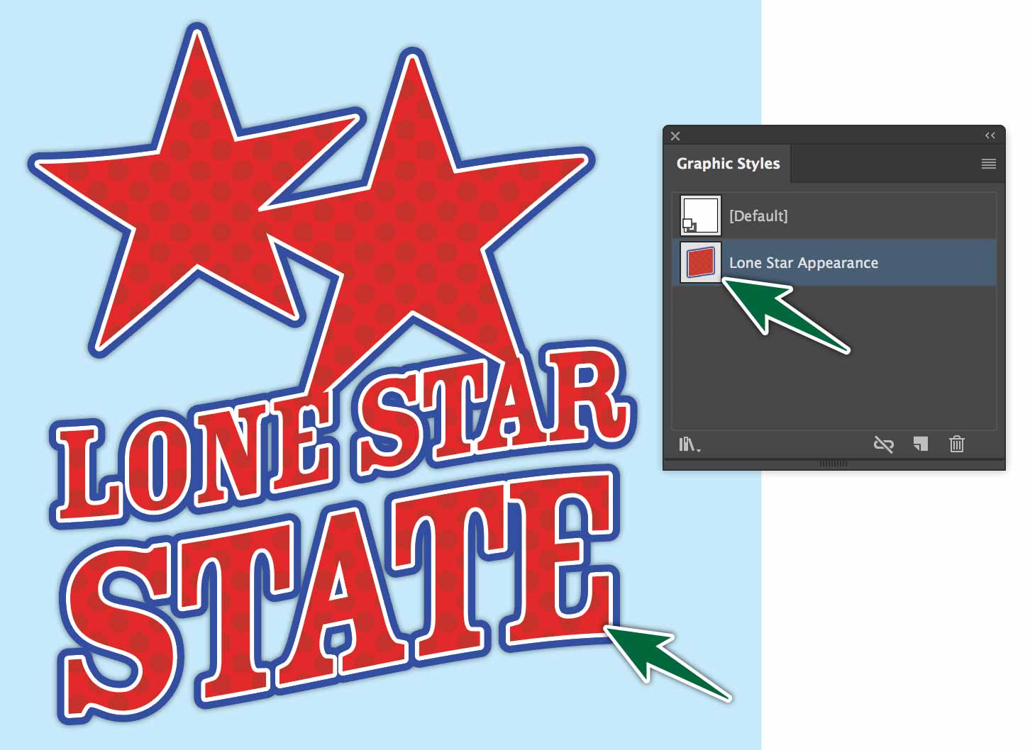
Graphic Styles
Graphic Styles are stores Appearances. So if you build an oval with a fill and two stokes, you can save that appearance in the Graphic Styles Panel. You’re not saving the fact that it’s an oval, you’re only saving its attributes.
Creating Graphic Styles
One simple way to save a Graphic Style is to select an object with the attributes you want, then click the New button at the bottom of the panel. Make sure you name your styles, so you can find them easily.
You can also drag artwork into the Graphic Styles panel. All it stores is its attributes, not the actual artwork.
Applying Graphic Styles
To apply a graphic style, all you need to do is select the object, then click on the style in the panel.
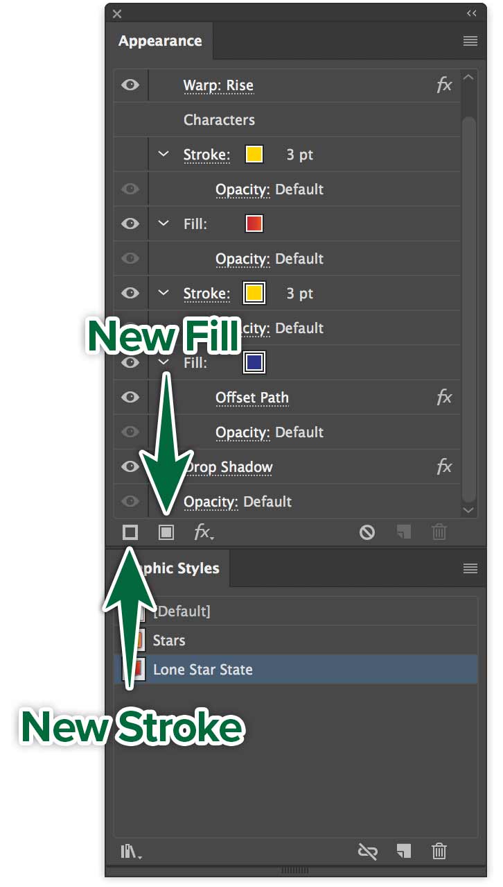
Updating Graphic Styles
The payoff for using graphic styles really comes when you need to edit them. You can update all instances of the graphic style on the page in one go. Just edit one instance, then choose Redefine Style from the Appearances panel menu. You can also option-drag the edited artwork’s icon from the Appearance panel onto the style in the Graphic Styles panel.
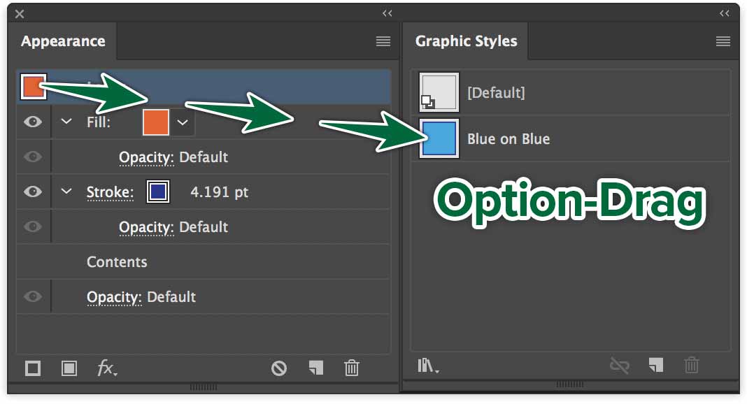
When you ⌥-drag the new appearance onto the existing graphic style, all artwork with that style applied gets updated with the new appearance.
Expanding Appearance
When you build an object in the Appearance panel, it can have multiple fills and strokes. Expanding objects separates the elements into the separate parts. You want to expand the appearance of artwork if you need to edit the individual parts. The important thing to remember is to expand a copy of your artwork. Keep the live art with the appearances intact.
Formative Activity
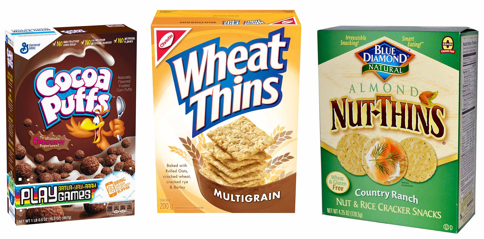
Food identity design is a prime example of the use of stacked appearance attributes. See the examples below. See how the brand names have multiple strokes and fills with gradients? This is what we’re aiming to create.
Create your own custom food brand. Don’t use an existing name. You can create one that’s an offshoot of a name. Make the artwork unique and your own. Choose fonts only from Adobe Fonts. Create a letter-sized Illustrator document in the appropriate orientation for your brand.
Go to Adobe Fonts to activate the font for your brand. The point is to work with Appearances and Graphic Styles.

In my example above, you can see that I left progressive versions as I worked. What you need to do is keep your wordmark with all its properties in the Appearance Panel. In the end, the wordmark needed to be expanded to achieve the final look. You can do this too. Do it only at the end and only if necessary.
In your file, you may end up with only one piece of artwork, if expanding isn’t necessary. If it becomes necessary, keep a live copy and an expanded copy.
Expand a Copy of Your Art
Once you are done, option-drag your artwork on the page to make a duplicate. Select that art, and go Object > Expand Appearance. This will outline your work. This way, when I grade, I won’t have to load all the fonts you’ve used unless necessary.
